
#Branding #DesignStrategy #BrightonCreative #PackagingDesign
15 April 2026
The Context
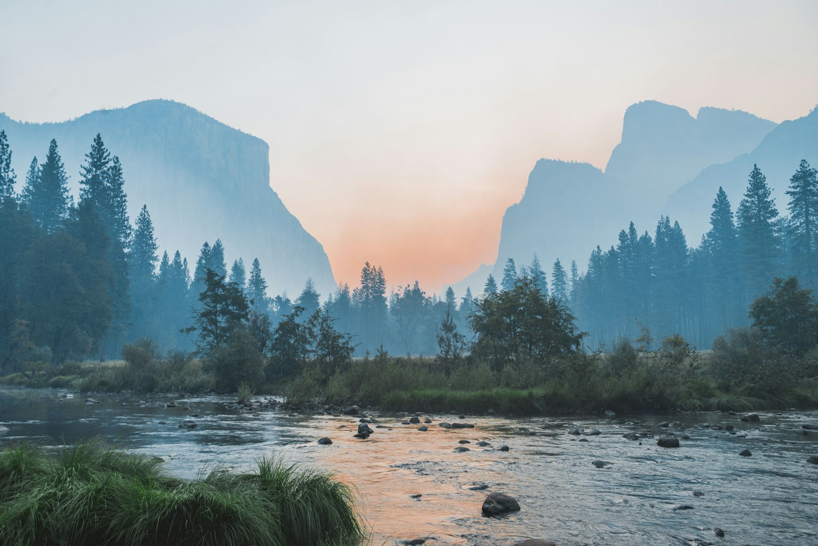
There is a specific kind of clarity that comes with working on the edge of the island. As we sit here in our studio on a Wednesday afternoon in April, the light reflecting off the English Channel isn’t just a nice backdrop: it’s a functional part of our creative process. For a branding agency in Brighton, the environment isn't just where we work; it’s the lens through which we view every project that hits our desks.
In the design world, we often talk about "craft" as if it’s a static thing: a set of skills or a particular software proficiency. But in 2026, craft has evolved. It has become synonymous with intentionality. As the digital landscape becomes increasingly saturated with AI-generated noise and hyper-fast trends, the true luxury in design is no longer just "high-end" aesthetics. It is the ability to create work that feels grounded, human, and luminous.
We’ve spent years refining our approach at Wetton&Co, and we’ve realised that being a branding agency in Brighton offers us a unique strategic advantage. We aren't tucked away in a windowless London basement; we are exposed to the shifting gradients of the coast. This exposure dictates how we handle colour, how we space our typography, and how we build a brand identity strategy that actually stands the test of time.
The Challenge
The challenge facing modern brands: especially those trying to scale from local gems to national icons: is the "flattening" of the visual world. Everything is starting to look the same. The same minimalist sans-serifs, the same safe colour palettes, the same predictable layouts. When every brand is following the same "best practice" playbook, the result is a sea of sameness where nobody actually gets noticed.
We see this most often in the FMCG sector. A startup comes to us with a brilliant product but a visual identity that feels like a whisper in a crowded room. They’ve been told to be "clean," but they’ve ended up "invisible." Our job is to inject that elusive quality of atmosphere into their brand: to take the raw ingredients of their mission and cook them into something that feels premium and inevitable.
The tension we often navigate is between being "bold" and being "sophisticated." Many agencies think you have to choose one or the other. You’re either loud and neon, or you’re quiet and beige. At Wetton&Co, we reject that binary. We believe the most powerful brands are those that can be both: brands that carry the energy of a Brighton sunset but the structural rigour of a mathematical grid.

The Vision: Designing with Coastal Light
When we talk about "coastal light" as the new luxury of craft, we’re talking about a specific aesthetic philosophy. It’s about transparency, depth, and the way shadows interact with solid forms. In Brighton, the light is never flat. It’s constantly moving, bouncing off the water and catching the textures of the pebble beaches and the peeling paint of the seafront.
This translates directly into our work as a packaging design agency. When we design for the shelf, we aren't just thinking about a 2D label; we’re thinking about how the light hits the material. Is it matte? Is it gloss? Does it have a tactile grain that makes someone want to pick it up?
The Elements of Coastal Craft:
: Luminous Colour Palettes: Moving away from muddy, digital-first tones towards colours that feel like they have an internal light source.
: Structural Honesty: Using layouts that don't hide behind "fluff." Every element must earn its place on the page.
: The Grit and the Polish: Just like Brighton itself: which is a mix of Regency elegance and seaside grit: we love pairing high-end typography with raw, textured imagery.
This vision was central to our work on the "Wildpool UK" campaign. We didn't want a safe, outdoor-brand look. We wanted something that felt like a punch to the chest. By using bold oranges and deep silhouettes, we captured that specific "golden hour" energy that you only get when the sun is dropping into the sea. It’s not just a billboard; it’s a mood. It’s brand-vs-production storytelling applied to a physical space.
The Strategy: Beyond the Logo
A common misconception is that a branding agency in Brighton just makes things look "cool." But "cool" doesn't sell products at scale. Strategy does.
Our brand identity strategy is rooted in what we call the "10-Year Horizon." We aren't interested in what’s trending on TikTok this morning. We’re interested in what will still feel relevant in 2036. This requires a level of mathematical precision in our logo design that ensures the mark is as functional as it is beautiful.
Take our work for the "English Cheesecake Co". The task was to take a beloved brand and make it feel premium enough for the modern retail environment without losing its heritage. We leaned into the "luminous" philosophy: using bright, citrusy yellows and high-impact white typography. We used a magnifying glass approach to the graphic details, ensuring that every millimetre of the packaging felt considered.

This is where the "luxury of craft" becomes tangible. It’s in the shelf standout strategy. When a consumer is walking down a frozen aisle, they aren't reading your brand story. They are reacting to a visual hierarchy. If that hierarchy is muddy, you lose. If it’s sharp, clear, and "lit" correctly, you win.

The Result: The Human Edge
As we move deeper into 2026, the value of the "human edge" in design is skyrocketing. AI can generate a thousand layouts in a second, but it cannot understand the feeling of a Brighton morning. It cannot understand why a certain shade of blue feels "expensive" while another feels "cold."
That’s why we’ve seen a massive shift toward tactile branding. Clients are coming to us because they want their brand to feel like it was made by people, for people. They want the imperfections, the textures, and the strategic soul that only a dedicated creative agency in Brighton can provide.
Whether it’s a bespoke packaging project for a film production or a nationwide retail scale-up, our process remains the same. We start with the light. We find the clarity. We build the strategy. And then we craft the hell out of the visuals.
The Outcome
The result of this coastal-inspired approach is a portfolio of work that doesn't just sit on a screen: it lives in the world. It’s work that has a heartbeat.
We’ve seen our clients go from local startups to household names, and the common thread is always the same: they dared to be distinctive. They chose to step away from the "grey" of standard corporate design and embrace something more visionary.
Working with a branding agency in Brighton like Wetton&Co isn't just about getting a new logo. It’s about resetting your brand’s internal compass. It’s about realising that in a world of infinite digital noise, the most luxurious thing you can be is clear.
Our Process Highlights:
: Immersion: We spend time understanding the "vibe" before we touch a mouse.
: Iteration: We explore the boundaries of the brief to find the unexpected.
: Precision: We refine the chosen path until it is mathematically sound.
: Soul: We add the final "Brighton" layer: that touch of coastal light that makes the work sing.
If you’re looking to evolve your brand or launch something that truly breaks the mould, we’d love to show you how we work. Whether you're based in London, New York, or right here in Brighton, the light is the same: you just have to know how to catch it.
Are you ready to bring some clarity to your brand?
We’re always looking for visionary partners who value craft as much as we do. If you’ve got a project that needs a bold, strategic edge: whether it’s a full rebrand, a new packaging range, or a high-impact marketing campaign: let’s talk.
Get in touch with the studio today.
Next Project: New Nostalgia: Why the 90s are Winning 2026