
#FilmDesign #ProductionDesign #HeroProps #TVGraphics
31 January 2026
When you're watching a character grab a cereal box during a kitchen scene or scroll through a fictional social media feed, you're witnessing the invisible craft of graphic design in production. These aren't afterthoughts or stock props pulled from a warehouse: they're carefully designed elements that bridge the gap between what's written in the script and what needs to exist, physically, on screen.
We work in this exact space: creating bespoke packaging, fictional branding, and hero prop graphics for film and television productions. It's a specialized niche that sits at the intersection of graphic design and production design: and it's a collaboration that most audiences never see, but always feel.
The Art Department Ecosystem
Here's how the hierarchy works on set: production designers establish the overall visual concept of a production. They're the architects of the entire aesthetic vision: colour palettes, spatial design, atmosphere, period accuracy. They answer to the director and translate the script into a cohesive visual world.
Graphic designers: that's us: operate within that framework. We're part of the art department, but our focus is surgical: we execute the specific on-screen visual elements that need specialized design skills. Think product packaging for a fictional brand, newspaper headlines from the year 2087, a tech startup's logo that appears in the background of a boardroom scene, or the branding for a period-accurate whiskey bottle.
We don't set the vision. We make it real.

This is where the work stops being “a layout” and starts being a prop — the real bar shot proves texture, scale, and on-screen readability in one frame.
According to BAFTA, the collaboration between graphic artists and production designers is essential during pre-production to ensure that every visual element: no matter how brief its screen time: aligns with the narrative, time period, and aesthetic vision. This early partnership is where the magic happens: understanding not just what needs to be designed, but why it exists in the story.
From Brief to Build: The Process
The process starts long before cameras roll. We meet with the production designer early in pre-production to discuss exact requirements. These conversations are detailed: What does this fictional energy drink brand say about the character who drinks it? What would a 1960s detective's case files actually look like? How does a dystopian government communicate through propaganda posters?
Every element we design has to pass the "five-second test": if it's on screen for five seconds, would someone in the industry spot that it's fake, lazy, or historically inaccurate? That's the bar.
We work alongside specialist researchers, prop masters, and sometimes VFX teams to ensure authenticity. For period pieces, this means sourcing era-appropriate typefaces, printing techniques, and material finishes. For futuristic or fantasy projects, it means inventing design languages that feel plausible within the world being built.
The workflow looks like this:
: Script breakdown: identify every graphic element mentioned or implied
: Creative brief: collaborate with production designer on aesthetic direction
: Concept development: explore design routes that fit the narrative
: Refinement: iterate based on feedback from director, production designer, or continuity team
: Production: create print-ready or screen-ready files, often working with specialist fabricators
: On-set support: sometimes we're on set to ensure graphics are used correctly or to make last-minute adjustments
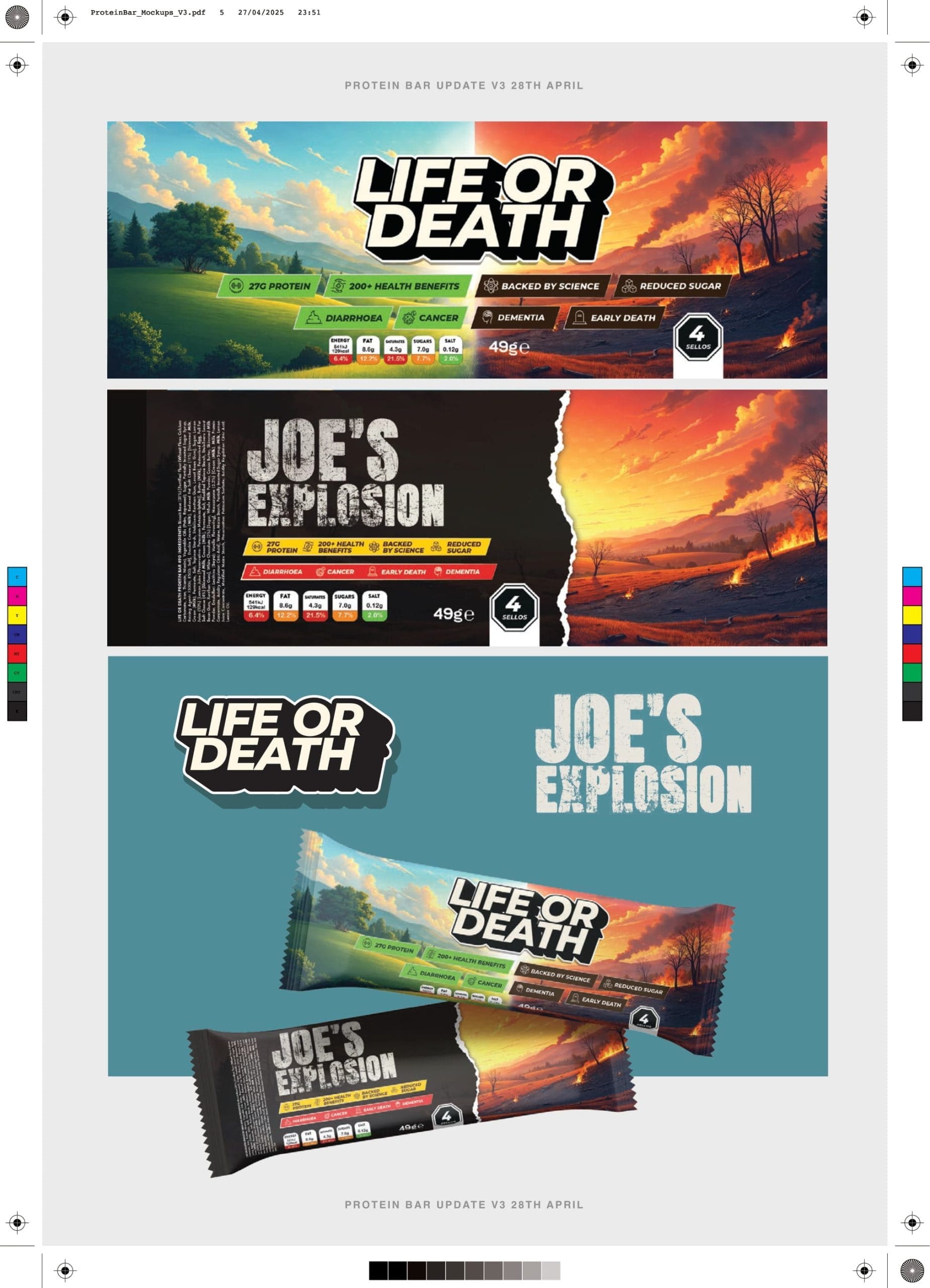
We drop it into shelf context to stress-test the same thing production design cares about most: does it read instantly when it’s dressed, lit, and only on screen for seconds?
Hero Props: When Packaging Becomes a Character
Hero props are the graphic elements that get close-ups or play a functional role in the story. A character picks up the box. The camera lingers on the label. The brand name is spoken in dialogue. These aren't background dressing: they're supporting cast.
Our work on the Joe Wicks: Licensed to Kill protein bar packaging is a perfect example. The brief wasn't just "design a protein bar." It was: create a premium, TV-ready product that feels authentic enough to exist on a real shelf, bold enough to hold the screen, and strategically aligned with Joe's brand while fitting the tone of the show.
The packaging had to work in multiple contexts: extreme close-ups during product shots, mid-range shots on kitchen counters, and wide shots in retail-style displays. That means every detail: typography hierarchy, colour contrast, material finish: had to be broadcast-grade. The design needed to read clearly on screen under studio lighting, but also feel tactile and real when Joe held it.
This is where the collaboration between graphic design and production design becomes critical. The production designer might specify that the scene requires a "premium wellness aesthetic," but we translate that into kerning decisions, foil finishes, and structural packaging formats. We ensure the label doesn't create glare under lights. We check that the typeface is legible at the camera distance the DP has planned.
Fictional Brands That Feel Real
One of the most challenging: and creatively satisfying: aspects of this work is designing fictional brands that feel lived-in. A cereal brand that's been on shelves for 30 years has visual equity: slight inconsistencies, design trends from different eras, wear patterns. A startup's branding looks different than a heritage brand. A government-issued document has bureaucratic design language.
We obsess over these details because audiences intuitively know when something feels off, even if they can't articulate why. A 1950s cigarette pack with a sans-serif typeface breaks immersion. A sci-fi product with outdated gradients feels cheap. The goal is always the same: make it so believable that the audience never questions it.
According to Screen International, the rise of high-definition and 4K production has raised the stakes for graphic artists. What used to be a background blur is now clearly visible, which means the craft has to be flawless. There's nowhere to hide.
Technical Execution: The Invisible Discipline
Beyond aesthetics, there's a technical discipline to this work that most people outside the industry don't see. We're not just designing: we're problem-solving across multiple formats and production constraints.
Print production: If a package needs to exist physically, we work with specialist printers and fabricators to ensure the design translates from screen to substrate. That might mean adjusting for material limitations, ensuring colour accuracy under set lighting, or designing for specific folding or die-cutting requirements.
Screen graphics: For UI design or motion graphics that appear on in-world screens, we create assets that feel native to the technology being shown. This often means working closely with VFX teams to ensure our designs can be composited seamlessly.
Continuity: Every graphic element needs to be documented and reproducible. If a scene is reshot weeks later, the props need to match exactly. We maintain detailed asset libraries and source files for every production.
Approvals: Depending on the production, we might need legal clearances to ensure our fictional brands don't accidentally infringe on real trademarks. This adds another layer of research and iteration to the process.
Why This Matters
At the surface level, this work is about making things look good on camera. But the deeper truth is that these graphic elements build worlds. They're the textures that make a story feel tangible. They're the details that signal genre, class, time period, and cultural context without a single line of dialogue.
When we design packaging for a fictional luxury skincare brand, we're communicating something about the character who uses it. When we create the branding for a dystopian corporation, we're reinforcing the themes of the narrative. Every design choice is a storytelling choice.
This is why the collaboration between graphic designers and production designers is so critical. We're not decorating: we're translating narrative into visual language. The production designer sets the tone, and we ensure that every label, logo, and letterhead sings in that same key.
For us at Wetton&Co, this work represents the intersection of everything we do: strategic branding, meticulous craft, and an understanding that design always serves a larger purpose. Whether it's packaging design for real products or fictional ones, the discipline is the same: make it meaningful, make it beautiful, make it work.
Let's Build Your World
If you're a production designer, art director, or producer working on a film or TV project that needs bespoke graphic design, hero prop packaging, or fictional brand development, we should talk. We understand the deadlines, the technical requirements, and the creative rigor this work demands.
Check out our full portfolio of work to see how we approach projects across branding, packaging, and film design: or get in touch to discuss your next production.
Next Project → Sunrise Coffee Packaging