
Joe Wicks: Licensed To Kill
Wetton&Co were tasked with building out the brand concept behind the Killer Bar
When KEO Films and Channel 4 approached Wetton&Co to help bring Joe Wicks’ new Killer Bar project to life, we knew we were stepping into a conversation far bigger than packaging alone. This wasn’t just another snack launch — it was part of Joe Wicks’ Channel 4 documentary “Joe Wicks: License to Kill”, a programme designed to shine a light on the health claims of ultra-processed foods.
At its heart, the Killer Bar project is about questioning the way protein bars and other so-called “healthy” snacks are marketed. Joe Wicks wanted to spark awareness of how easily consumers are drawn in by packaging and messaging — and how much design can influence our choices. That’s where our role began.


The Brief
Wetton&Co were tasked with building out the brand concept behind the Killer Bar. The name had already been set, but the rest was open: packaging design, website design, social media assets, and the typography for the documentary’s title sequence.
The challenge was to design something that looked real, credible, and desirable — just like the protein bars you’d find in supermarkets — while also carrying an underlying message. The design needed to both attract and question: why do we trust a snack’s health credentials simply because the packaging looks fun, clean, or fitness-oriented?

Brand Guidelines
To ensure consistency across every touchpoint of the Killer Bar identity, we developed a concise set of brand guidelines. These guidelines balanced the boldness of the concept with practical rules for application across packaging, digital assets, and broadcast.
Typography
We specified Glancyr Medium as the primary typeface, chosen for its bold, modern aesthetic that feels both functional and eye-catching. For flexibility, Montserrat Medium acts as a secondary option, ensuring accessibility when the main font isn’t available.
Colour Systems
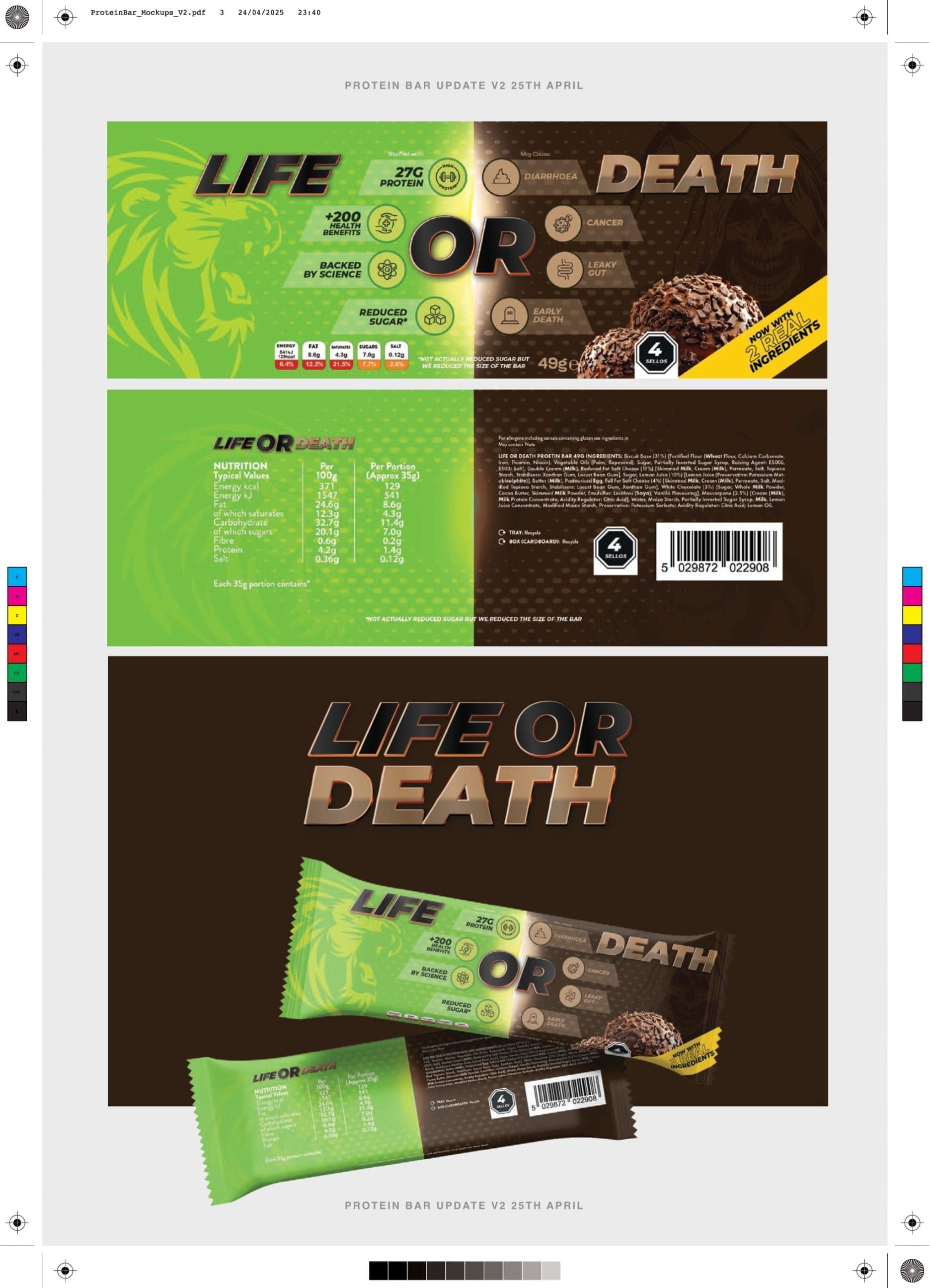
We introduced a split system of Life and Death palettes, inspired directly by the themes of the Joe Wicks Protein Bar and its role in the Channel 4 documentary.
The Death Side leaned into dark, impactful tones — Killer Red, Blood, Reaper Noir — creating a sense of urgency and intensity.
The Life Side contrasted this with fresher, more hopeful colours like Joe Green, L’Orange, and Night Forest.
This dual approach gave the brand flexibility to shift tone depending on the narrative — from playful wellness to sharp critique.
Logo Variants
We produced two core logo treatments depending on whether the Life or Death side of the story was being told. Each logo retained the same typographic base but with subtle red or green gradient strokes to align with its context. This duality reinforced the core message: design can completely change perception.
By establishing these guidelines, we made sure that Killer Bar wasn’t just a one-off prop for the documentary, but a fully-formed brand world. From packaging to screen graphics, every element was connected by a cohesive design language that amplified Joe Wicks’ message around ultra-processed foods.


The Creative Journey
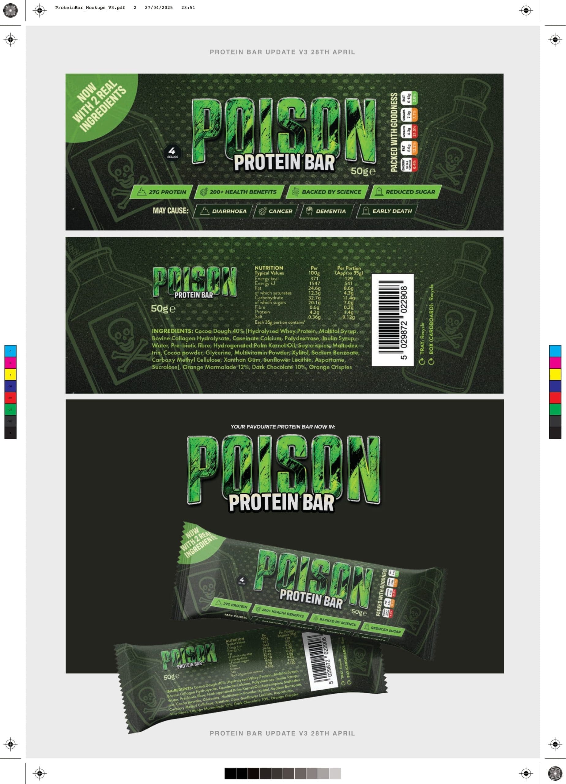
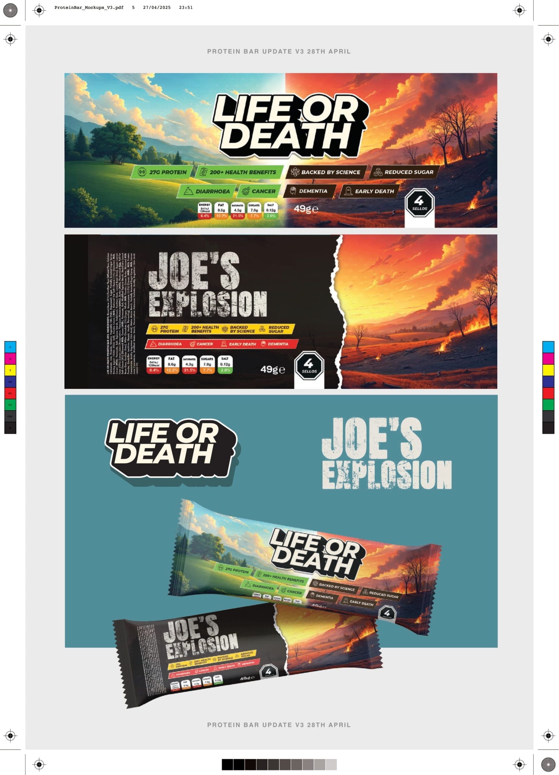
We knew this project demanded depth and experimentation. Across the course of the project we produced and refined over 20 packaging design variations, each exploring a different direction in tone, colour, and shelf appeal.
Some concepts leaned into the high-energy world of fitness snacks: bold typography, neon colours, and “fuel-for-your-workout” styling.
Others took a subtler approach, playing with minimalist design, softer palettes, and health-halo cues designed to feel premium and trustworthy.
Several versions pushed the boundaries further, experimenting with playful illustrations and unconventional layouts that made the bar feel almost too fun to resist.
This extensive back-and-forth process with KEO Films and Channel 4 was deliberate — each design raised new questions about how consumers perceive protein bars. The sheer volume of iterations reflected the very point Joe Wicks was making: packaging sells, often more than the product itself.


Beyond the Bar
Our work didn’t stop at packaging. To build out the Killer Bar world, we also created:
Website design: A clean, responsive landing page to showcase the product and tie into the wider themes of the documentary, expertly developed and managed by Rifle Design
Social media asset design: A bank of ready-to-use visuals for Instagram, TikTok, and beyond, ensuring the bar could live convincingly across platforms.
Title screen typography: The on-screen graphics for “Joe Wicks: License to Kill”, echoing the same bold, direct design language used on the bar itself.
Each touchpoint was designed to reinforce the illusion of Killer Bar as a genuine supermarket product, while holding up under the scrutiny of broadcast television.


The Meaning Behind the Design & The Outcome
Every creative decision fed back into the documentary’s central message: don’t judge a bar by its wrapper. By making the Joe Wicks Protein Bar look as appealing as anything else on the market, we created a case study in consumer psychology.
The layers of colour, typography, and layout became tools to ask: if a protein bar looks fun, fresh, and healthy, do we automatically believe it is? And if so, how do brands use this to their advantage?
The Killer Bar design process wasn’t just about reaching a final product — it was about using design itself as a lens to question trust, perception, and the blurred line between health and hype.
The Outcome
The finished Killer Bar packaging stood shoulder-to-shoulder with real brands on supermarket shelves and on screen. It was convincing enough to pass as the next big protein launch, but its true role was to provoke — to highlight just how easily ultra-processed foods are marketed as healthy through clever branding.
For Wetton&Co, this project was a chance to show the power of design not just in selling products, but in starting conversations. Working alongside KEO Films and Channel 4, we helped transform an idea into a tangible, visual case study for Joe Wicks’ mission to raise awareness around food marketing.
Send us an email, to
discuss a new project.
If the Killer Bar project has sparked ideas for your own brand, we’d love to hear from you. At Wetton&Co, we specialise in turning ambitious concepts into bold, tangible design — whether that’s packaging, digital, or full brand worlds. If you’re ready to start a project with us, drop us an email today and let’s make it happen.
