#PackagingDesign #Branding #MotionDesign #FilmDesign
27 September 2026
10 min read
The strongest packaging brands do more than win attention in an aisle. They create a world people recognise wherever they encounter it: on a shelf, in a social post, on a website, in a product photograph, or on screen.
That is where our work as a packaging design agency meets our experience in title graphics and motion design for film and television.
We approach packaging as a visual narrative. The pack becomes the opening frame. The logo becomes the title treatment. Typography establishes the tone. Colour creates atmosphere. The first encounter carries a small moment of drama. Enough to make the brand memorable before anyone has read every word.
This is not the same as simply making packaging “look cinematic”. It is a more disciplined idea: build a recognisable visual world, then make every touchpoint behave as though it belongs inside it.
The Challenge
Packaging has a difficult job.
It has to communicate quickly, compete with neighbouring products, explain what is inside, establish a price and quality perception, and give people a reason to choose it. It also has to work across formats that change constantly: physical shelves, e-commerce listings, social media, retail displays, unboxing content and campaign photography.
That creates a familiar tension:
- The design needs to be distinctive, but not confusing.
- It needs to carry personality, but remain clear.
- It needs to feel premium, but not distant.
- It needs to work as a physical object, but also as a flat image on a screen.
Our experience in film and TV makes this tension especially useful to explore. Title design has to create atmosphere in a few seconds. It has to establish a narrative, signal genre and remain legible while moving, cutting or appearing within a larger composition.
Packaging operates under similar pressure.
A product may only appear for a moment in a social video. A shopper may see one face of a box from several metres away. A customer may photograph the pack on a kitchen surface, where the surrounding environment becomes part of the brand experience.
So we do not treat packaging as an isolated surface. We build it as part of a wider brand system.
This is also what separates this approach from our earlier packaging work on scaling food brands from local to nationwide retail. That work focused on recognition, range architecture and retail readiness. It is different again from our thinking around EPR and packaging compliance, where the priority is making regulatory requirements work within a considered design system.
This article is about the creative advantage that sits underneath both: visual world-building.
The Result
When packaging is built like a film title, it becomes more than a container.
It becomes a recurring visual cue. A recognisable object within a story. A piece of brand theatre that can move between contexts without losing its identity.
We saw this clearly with The English Cheesecake Company. The bright yellow pack does not rely on a single logo placement to be remembered. It builds recognition through a complete visual language:
- A bold, high-contrast colour world.
- Distinctive, expressive typography.
- Product imagery that creates appetite and scale.
- Clear statements such as “Eat Me Frozen”.
- Graphic shapes that give the range a sense of movement.
- A hierarchy designed to work both close-up and from a distance.
The result feels energetic and indulgent, but it remains easy to navigate. The flavour is clear. The product is visible. The brand has a strong entrance.
That balance matters.
A purely functional pack can communicate information without creating much feeling. A purely expressive pack can create atmosphere while making the product difficult to understand. The strongest result sits between the two: immediate clarity with enough character to invite a second look.
The English Cheesecake Company system carries that balance into different flavours, formats and collaborations. It works as a retail object, but it also creates a visual asset that can be photographed, shared and remembered beyond the freezer aisle.

Solution
We begin by asking the same question that guides title design: what world does this brand belong to?
That question moves the process beyond surface references. It asks us to define the brand’s atmosphere, rhythm and point of view before we settle on individual graphic elements.
For a coffee brand, that world might be bright, social and slightly eccentric. For a wellness product, it might be calm and precise. For a protein bar, it might need to balance performance with provocation.
With Sunrise Coffee, we developed a visual world built around optimism, energy and approachability. The yellow-and-black palette creates immediate recognition. The illustrated characters add a sense of movement and charm. The typography stays bold and direct, while the system extends naturally across cups, bags, menus, receipts and printed communications.
The brand does not stop at the pack.
It creates a consistent scene around the product: one that can appear in a café, on a counter, in a photograph or inside a social post and still feel unmistakably like Sunrise Coffee.
This is where a recognisable type system becomes essential. We treat typography as more than a selection of fonts. It becomes part of the brand’s performance:
- How does it enter the frame?
- Which words deserve the strongest emphasis?
- Does it feel conversational or authoritative?
- Can it hold its shape when the format becomes narrow, circular or animated?
- Does it remain recognisable when the brand name is temporarily absent?
These questions are familiar from motion and title graphics. They also improve packaging decisions.
A strong type system gives the brand a rhythm. Large display typography can create the opening impact. Smaller supporting text can carry the detail. Repeated typographic behaviours can connect a product pack to a campaign headline, a website banner or a piece of social content.
The system creates continuity without making every touchpoint identical.
Designing for the moment of encounter
Film titles understand the importance of a first frame.
Packaging needs the same awareness. The front of pack is not just a list of selling points arranged on a panel. It is an entrance into the brand world. It controls where the eye lands, what gets understood first and what creates the emotional response.
Our Life or Death protein bar concepts explore this through contrast. The split between vibrant green and deep brown makes the product feel immediate and theatrical. The name creates tension. The visual language balances performance cues, nutritional information and a deliberately provocative tone.

The design uses a clear sequence:
- The name establishes the premise.
- The colour division creates a visual conflict.
- The lion illustration adds symbolic strength.
- Benefit icons organise information into fast-scanning units.
- Product imagery grounds the concept in something tangible.
That sequence behaves like a title sequence. It introduces the central idea, builds atmosphere and gives the audience enough information to understand the stakes.
The pack still has to work commercially. Nutrition, ingredients and mandatory information must remain accessible. But clarity does not require the design to become quiet.
We use hierarchy to make expressive decisions useful.
Designing for movement
The physical pack is only one frame in a much longer brand story.
We consider how the packaging might appear in:
- A product launch film.
- A short-form social video.
- An e-commerce gallery.
- An influencer unboxing.
- A point-of-sale display.
- A campaign image with multiple products in one composition.
This is where our film and TV experience changes the way we evaluate packaging. We think about scale, lighting, legibility, continuity and pacing. A pack has to retain its identity when it is held in a hand, placed in a prop environment or shown for only a few seconds.
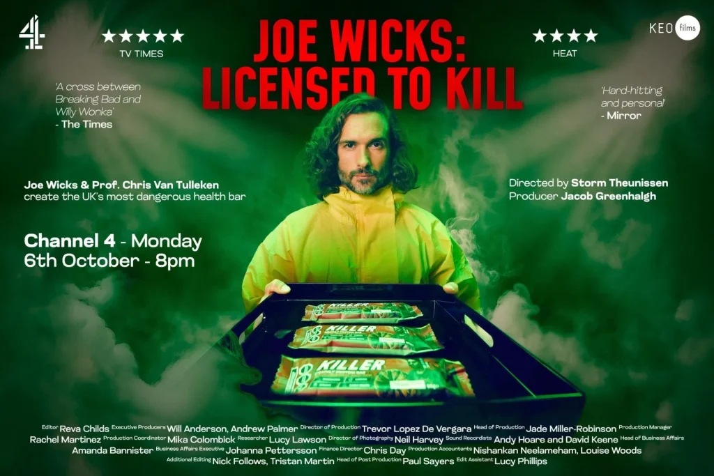
Our work on the Joe Wicks: Licensed to Kill protein bar packaging demonstrates this crossover directly. The product had to feel credible as packaging, but it also had to function as a hero prop within a broadcast context. The design needed enough visual authority for the camera, enough detail to feel real and enough clarity to support the wider title and campaign world.
That requires more than a polished front panel.
It requires a system with enough internal logic to survive close-ups, wider scenes and movement between physical and digital applications.

The Outcome
When we build packaging with narrative in mind, the result is not packaging that pretends to be film.
It is packaging with a stronger sense of identity.
The visual world gives the brand somewhere to go. It creates a foundation for social graphics, campaign art direction, websites, motion assets and future product lines. It means the brand can evolve without becoming visually fragmented.
Our work for Wildpool shows how this thinking operates beyond traditional packaging. The outdoor campaign uses bold blocks of colour, editorial typography and character-led imagery to create a recognisable world in public space. Each poster works as an individual message, but the set feels like a connected sequence.

That is the wider opportunity.
A brand can behave like a story without becoming complicated. It can create recurring visual cues, distinct characters, memorable lines and moments of contrast. It can make people feel that every encounter belongs to the same universe.
For packaging, this has a practical commercial value. A strong visual world helps products stand out, but it also helps people remember them. It gives retail design a better chance of becoming social content. It gives social content a clearer relationship with the physical product. It turns a single pack into an adaptable creative platform.
The best packaging does not end at the point of purchase.
It continues through the hands, camera rolls, kitchen surfaces and conversations that follow. It becomes part of how people describe the product and how they recognise it next time.
That is why we approach packaging as a narrative design discipline. We bring together shelf impact, brand strategy, typographic systems, product clarity and the visual drama we understand from film and television.
The outcome is a brand that does not simply occupy space.
It creates a world people want to return to.
If you are developing a product that needs to work across retail, social and screen, we would welcome a conversation about the world it could build. Working alongside a packaging design agency with experience in branding, motion and film graphics can create the balance between immediate impact and long-term recognition: one deliberate decision at a time.
Explore our packaging design work, or contact us to begin the conversation.
Next Project: Joe Wicks: Licensed to Kill Bar Packaging Design →