Categories: Film & TV, Documentary, Title Design
Date: 27 September 2026
Documentary title design has a different responsibility from drama, entertainment or advertising.
The story is real. The people are real. The evidence carries consequences.
That changes the brief.
A documentary title sequence still needs to create recognition, tension and momentum, but it cannot treat reality as raw material for spectacle. Its job is to establish the right kind of attention: curious rather than manipulated, serious rather than solemn, and distinctive without overpowering the subject.
Our work on “Joe Wicks: Licensed to Kill” for KEO Films and Channel 4 gave us a clear example of that balance. The film has a deliberately punchy premise: Joe Wicks and Professor Chris van Tulleken create a protein bar using ingredients associated with serious health concerns, then use the product to question how ultra-processed food is regulated and marketed.
The visual language needed to attract attention. It also needed to hold up under scrutiny.
The Challenge
How do we make a real story feel urgent without making it feel exaggerated?
That was the central tension.
The programme was not a fictional thriller, even though its title suggested one. It was a one-off factual documentary built around a provocative investigation into food regulation, consumer trust and public health. As Channel 4’s programme description explains, the film follows Joe Wicks as he develops what is presented as the UK’s most dangerous health bar.
The design therefore had to balance two opposing energies:
-
The punch of a campaign visual language: bold type, strong contrast and a title with immediate impact.
-
The authority of documentary communication: clarity, restraint and enough space for the subject to remain credible.
This is where documentary title design separates itself from entertainment packaging. A drama can heighten reality into atmosphere. A factual film has to be careful not to imply more than the evidence supports.
That does not mean the design should become flat or cautious.
It means every visual decision needs a reason.
The title “Licensed to Kill” contains an obvious tension. It is dramatic, memorable and deliberately uncomfortable. Our role was not to soften that tension, but to frame it properly, so the language felt like an editorial question rather than a piece of empty shock marketing.
The same principle shaped the relationship between the programme title and the Killer Bar itself. The bar had to look convincingly like a consumer product because that was central to the film’s argument: packaging and presentation influence what people believe about what they are buying.

Image: Wetton&Co project archive, packaging concept developed for the “Killer Bar” project.
Solution
Typography carries editorial authority
In documentary title design, typography often carries more responsibility than decoration.
A typeface does not simply make a programme recognisable. It tells the audience how to read what follows. Is this a spectacle? An investigation? A personal account? A warning? A cultural observation?
For “Joe Wicks: Licensed to Kill”, the title needed to feel direct and unmissable. The red, condensed lettering creates urgency, while its scale gives the programme a clear broadcast presence. But the surrounding information does the important balancing work.
The title artwork places the programme within a factual context: the Channel 4 identity, the KEO Films mark, the contributors, the production credits and the description of the central investigation. The design is bold, but it does not hide what the film is about.
That distinction matters.
A title sequence can use dramatic typography without pretending that the story is something it is not. It can create a visual hook while still giving the subject an editorial frame.
We treated type as a hierarchy of information:
-
The programme title establishes the emotional charge.
-
Supporting copy explains the premise.
-
Contributor credits reinforce that this is a guided investigation.
-
Broadcast and production details anchor the work in a real factual context.
The result is not minimalism for its own sake. It is a controlled balance between attraction and explanation.
The type needs to stop the eye, then give the eye somewhere responsible to go.
Archive should clarify, not manipulate
Real footage and archive material are among the most powerful tools available to documentary title designers. They carry texture, period, evidence and human presence. They can also create misleading associations if they are edited purely for atmosphere.
Our starting point is always the same: archive should clarify the film’s world, not manufacture a conclusion before the film has made its case.
That means asking practical questions early:
-
Is this footage clearly relevant to the subject?
-
Could the edit imply a connection that the film does not support?
-
Does the audience understand whether the material is contemporary, historical or illustrative?
-
Are real people being used for emotional impact without enough context?
In a documentary about food, health and regulation, the temptation is to reach immediately for the most alarming imagery: medical environments, distressed faces, warning signs or catastrophic visual metaphors. Those choices may create intensity, but they can also move the sequence away from the film’s actual argument.
The stronger approach is often more specific.
A supermarket shelf. A product label. An ingredient list. A regulatory document. A hand placing a bar into a basket. These details connect the investigation to ordinary life, which is precisely where the stakes sit.
Archive can still move quickly, but the edit should respect what each image means. We would rather hold on a real piece of evidence than bury it beneath a rapid montage of generic concern.
That is where restraint becomes a form of credibility.
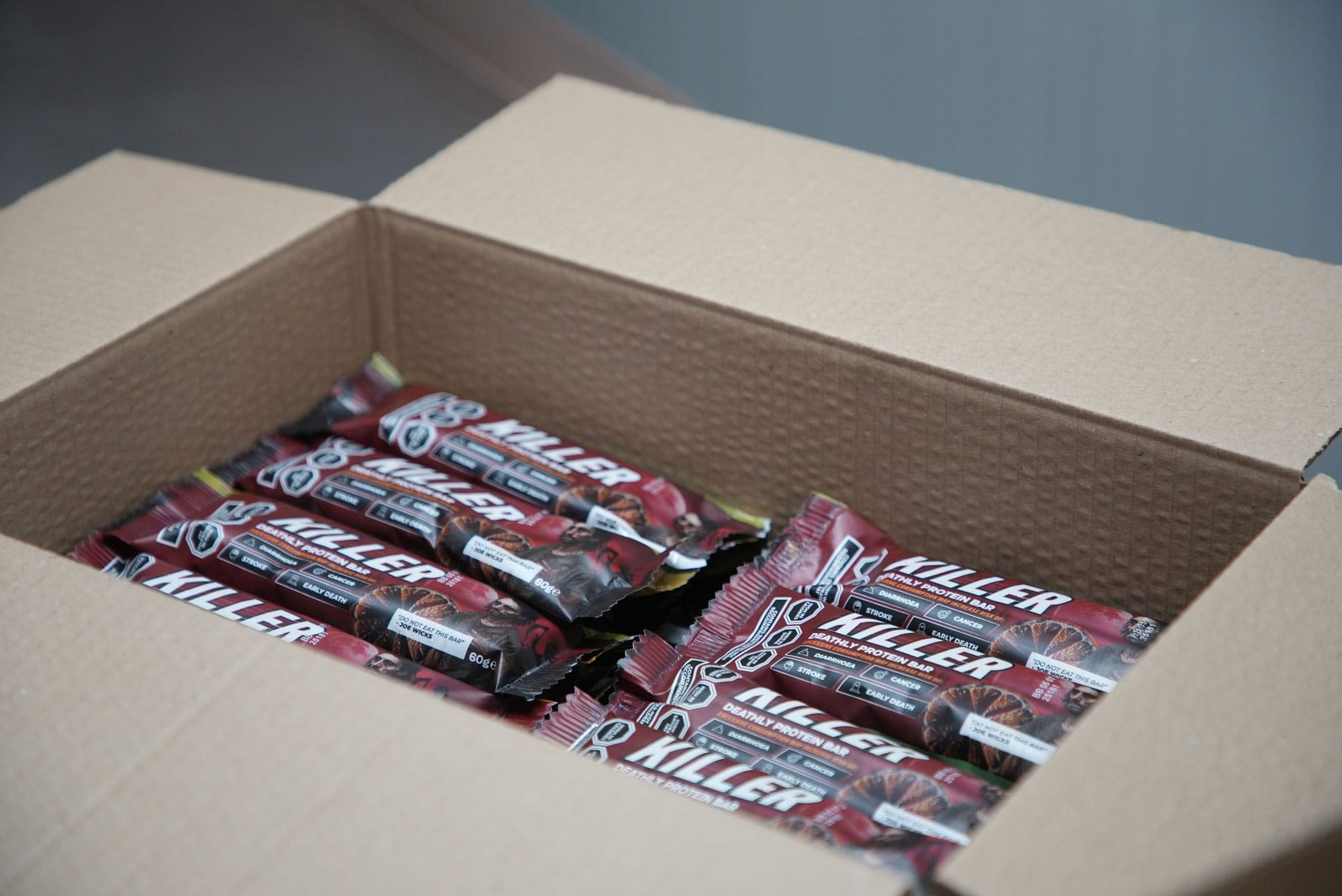
Image: Wetton&Co project archive, finished “Killer Bar” packaging prepared for the documentary project.
Pacing has to respect the subject
Drama often uses pace to control emotion. Documentary uses pace to create attention without taking control away from the material.
That difference is subtle, but important.
A factual title sequence can begin with energy. It can use short cuts, sharp transitions and a strong musical rhythm. The sequence still needs moments where information can land.
For a project like “Joe Wicks: Licensed to Kill”, that might mean moving between three distinct speeds:
The everyday: supermarket shelves, packaging, food preparation and familiar consumer behaviour.
The investigation: ingredients, evidence, expert voices, regulatory language and the mechanics of the stunt.
The reveal: the programme title and the question that connects the details.
These speeds create a rhythm between the accessible and the serious. The viewer recognises the world first, then sees the tension inside it.
We avoid treating every frame as a climax. When every transition is loud, nothing carries authority. A held title card, a slower push into a piece of information or a clean pause before the main lock-up can create more impact than another layer of effects.
The sequence earns its drama by giving the subject room to speak.
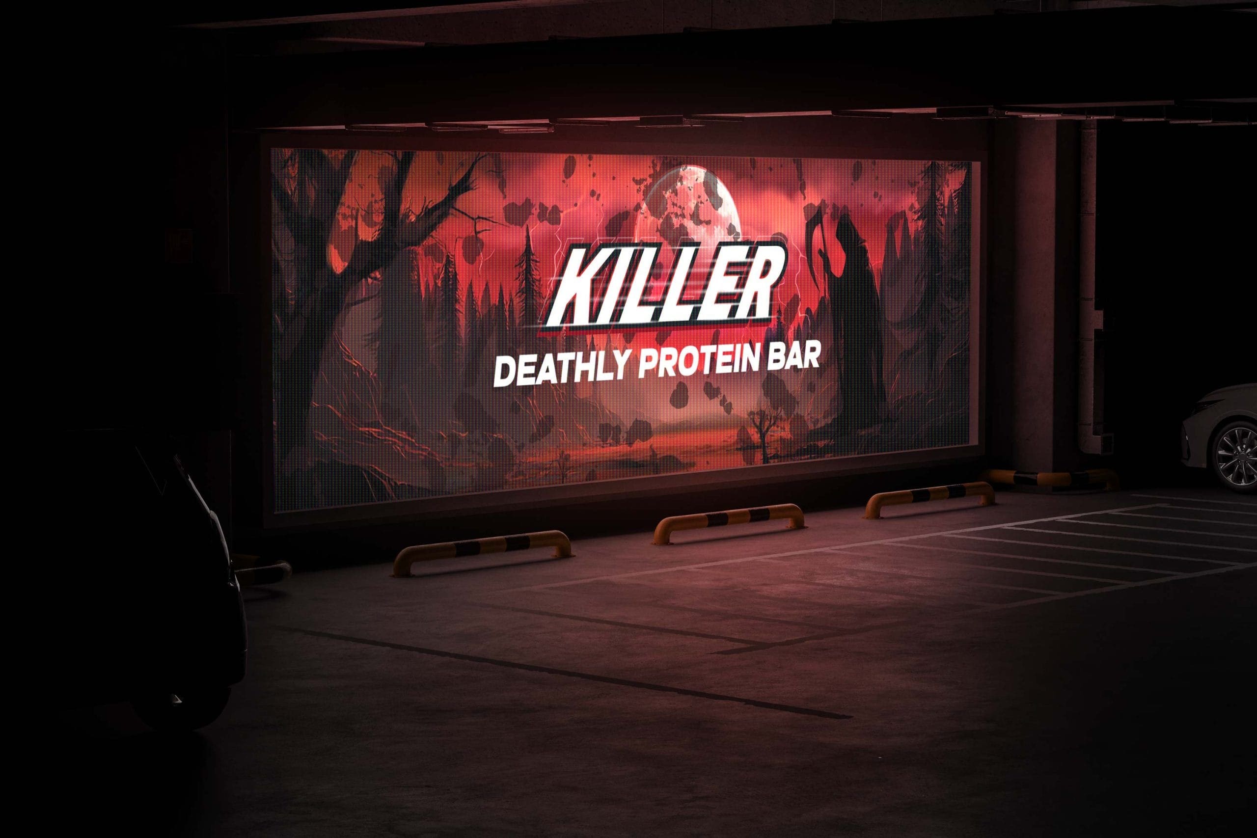
Image: Wetton&Co project archive, large-format application of the “Killer Bar” visual language.
The Result
A bold visual language with a serious centre
The finished visual world for “Joe Wicks: Licensed to Kill” uses contrast deliberately.
The green atmospheric background creates an uneasy, almost clinical environment. The red title introduces danger and urgency. White supporting type brings clarity and keeps the information legible. Together, these elements create a visual tension between the product’s apparent familiarity and the seriousness of the question behind it.
That contrast reflects the documentary itself.
The Killer Bar is designed to look like something that could exist on a shelf. The programme title pushes that familiarity into something darker. The title sequence sits between those two ideas: consumer appeal and critical scrutiny.
This is not a brand identity exercise transferred into film. It is a title system built around the editorial needs of a factual programme.
The design has to work in motion, not just as a still. Letterforms need to remain legible through movement. Credit cards need enough duration to be read. Transitions need to support the edit rather than compete with it. The visual language must hold together across broadcast frames, promotional artwork and digital cut-downs without becoming louder every time it changes format.
We developed the wider Killer Bar concept through more than 20 packaging variations, exploring the balance between fitness culture, premium health cues and darker warning signals. That exploration became useful to the title work because it revealed how quickly design can shift perception.
A colour change can move a product from optimistic to threatening. A type treatment can make a claim feel trustworthy or theatrical. A familiar layout can make an unusual object feel completely normal.
The documentary’s title design needed to demonstrate that power while remaining conscious of it.

Image: Wetton&Co project archive, an exploratory “Killer” packaging direction from the design process.
The Outcome
Documentary title design does not need to be quiet to be responsible.
It needs to be precise.
For “Joe Wicks: Licensed to Kill”, the final direction gives the film an immediate visual identity while keeping its central subject visible: how design, language and presentation influence belief. The title attracts attention, but the supporting system keeps that attention connected to the investigation.
That is the difference between spectacle and editorial authority.
The strongest documentary titles do not tell the audience what to feel. They establish the conditions for looking closely. They create a tone that is confident enough to be distinctive, but disciplined enough to respect the people and evidence within the story.
Working alongside KEO Films and Channel 4, we approached the project as a connected visual problem: how could a deliberately provocative product, a serious public-health question and a broadcast title system occupy the same frame?
The answer was not to reduce the tension.
It was to design it carefully.
If you are developing a documentary, factual series or film that needs a title sequence with both impact and integrity, we would welcome a conversation about the visual world around it. We can work alongside production teams from the first visual question through to the final title cards, campaign artwork and broadcast applications.
The best title design does more than introduce a programme. It establishes how the story deserves to be seen.