#DesignStrategy #StudioProcess #Branding #WettonAndCo
18 June 2026
There is a specific kind of energy that exists between the coastal lanes of Brighton and the glass-and-brick industrialism of London. It is a tension between creative freedom and strategic rigour: a balance we navigate every single day at "Wetton&Co".
People often ask us what happens after the first "hello." They want to know how a rough idea: perhaps a scribble on a napkin or a complex business problem: transforms into a bold, strategic visual system that stops the scroll and starts a conversation. We don't believe in "creative magic" that happens in a vacuum. Instead, we believe in a deliberate, occasionally messy, and deeply collaborative process that bridges the gap between a client’s vision and their audience’s reality.
This is a backstage tour of how we work.
The Challenge: It All Starts with the "Why"
Every project begins with a tension. A startup might have a revolutionary product but a visual identity that feels like a generic template. A production house might need a fictional brand for a film that needs to feel like it’s existed for fifty years.
We don't just "take a brief." We interrogate it.
The initial discovery phase is about stripping away the "what" to find the "why." We spend time in workshops: either in our Brighton studio or at a client’s London HQ: asking the difficult questions. Who are we actually talking to? What does success look like six months after launch? If this brand were a person, would people want to have a pint with them or hire them to do their taxes?
We treat this stage as a partnership. We aren't just vendors delivering a file; we are strategic guides walking you through decisions that will define your business's future.
The Discovery: Strategy Before Pixels
Before a single font is chosen or a colour palette is explored, we dive into the research. This isn't just about looking at what the competition is doing: though that is important: it's about understanding the cultural and commercial context of the brand.
We look for the gaps. If everyone in the sector is using "premium" navy and gold, maybe there’s an opportunity to be boldly minimalist or vibrantly loud. We explore:
: Audience Personas: What keeps your customers up at night?
: Market Positioning: Where do we sit on the scale of "playful" vs. "sophisticated"?
: Visual Audits: What signals is the current branding sending (and are they the right ones)?
This phase culminates in a strategic roadmap. It is the measuring stick against which every future design decision is held. If a concept doesn’t reinforce the strategy, it doesn’t make the cut.

The Solution: The Messy (and Meaningful) Middle
Once the strategy is grounded, the "making" begins. This is where the studio gets loud: and a little crowded with sketches.
We lean into Concept Development with a sense of playful exploration. We don’t just present one "perfect" idea. We explore multiple directions: each a different answer to the same strategic question. While some concepts might feel too literal and others perhaps too abstract, these experiments help clarify the path forward.
We often start on paper. There is a tactile sincerity to a pencil sketch that a digital tool can’t replicate. Whether we’re designing bespoke packaging for a new snack brand or a motion-led identity for a TV production, the goal is the same: to find the "spark."
During this phase, we look for:
: Visual Hierarchy: What do we want them to see first?
: Brand Tension: How do we balance heritage with modernism?
: Tactile Impact: In an increasingly digital world, how does the brand feel?
We then invite our clients into this process. We present routes not as "finished products," but as visual territories. We walk you through the rationale, explaining why "this" typeface carries the weight of authority or why "that" colour palette strikes a chord of nostalgia.
The Result: Building the Brand System
Once a direction is chosen, we move from "concepts" to "systems." A logo is never just a logo: it is the cornerstone of a wider visual language.
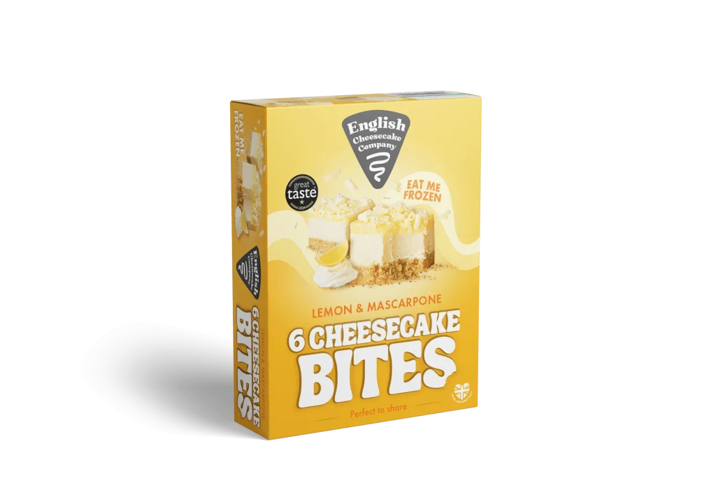
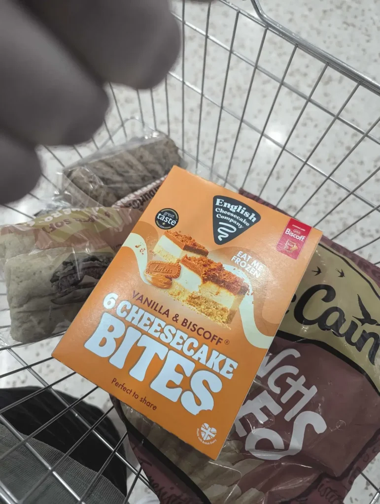
We build out the full brand identity, ensuring it works across every touchpoint. This means thinking about how a logo scales down to a favicon, how the typography performs on a frozen food aisle shelf, and how the visual style translates into high-impact social graphics.
Take our work for "Sunrise Coffee", for example. The challenge was to create something that felt approachable but undeniably energetic.

The solution wasn't just a mascot; it was a cohesive identity system that spanned takeaway cups, menus, and digital flyers. The bold black-on-yellow palette was a deliberate move to ensure the brand owned the morning commute. It was about making the customer feel something before they’d even had their first sip.
The Outcome: Beyond the Launch
Our process doesn't end when the files are sent. We believe the true test of a brand is how it lives in the wild.
We provide our clients with the tools they need to stay consistent. This includes comprehensive brand guidelines: which we prefer to think of as "brand playbooks": that empower internal teams to use the new identity with confidence. Whether it’s a startup scaling for nationwide retail or an agency looking to outsource their design needs, we ensure the transition is seamless.
We also look at the long-term horizon. In a world where AI is rapidly changing the search landscape, a brand’s visual and strategic authority is its strongest SEO signal. We design identities that aren't just trendy for today but are built for 2036.

Working Alongside Us
The best work happens when the lines between "client" and "agency" blur. We aren't here to just tick boxes; we’re here to be your creative partners. We bring the Brighton craft and the London strategy to every project, ensuring your brand doesn't just look its best, but performs its best.
If you’re ready to stop scrolling and start a conversation about your next project: whether it’s a full rebrand, a packaging system, or design for film and TV: we’re here to guide the way.
Ready to evolve? Let’s talk.
Next Project: The Power of Nostalgia: Designing the English Cheesecake Co x Squashies Collaboration