#PackagingDesign #BrandStrategy #FoodAndBeverage #RetailGrowth #July2026
The leap from a local kitchen to the national supermarket shelf is the ultimate test of a food brand’s mettle. It is a transition that demands more than just a great recipe; it requires a visual system capable of working as hard as the product inside. In the brutal, high-velocity environment of retail, your packaging is your only salesperson. It has exactly three seconds to stop a trolley, spark a craving, and justify a price point: all while competing against legacy giants with decades of brand equity.
At Wetton&Co, we view packaging not as a finishing touch, but as the critical bridge between a founder’s vision and a consumer’s basket. As a specialised packaging design agency, we’ve seen how strategic design can transform a niche favourite into a household name. This isn't about decoration: it’s about strategic architecture.
The Challenge
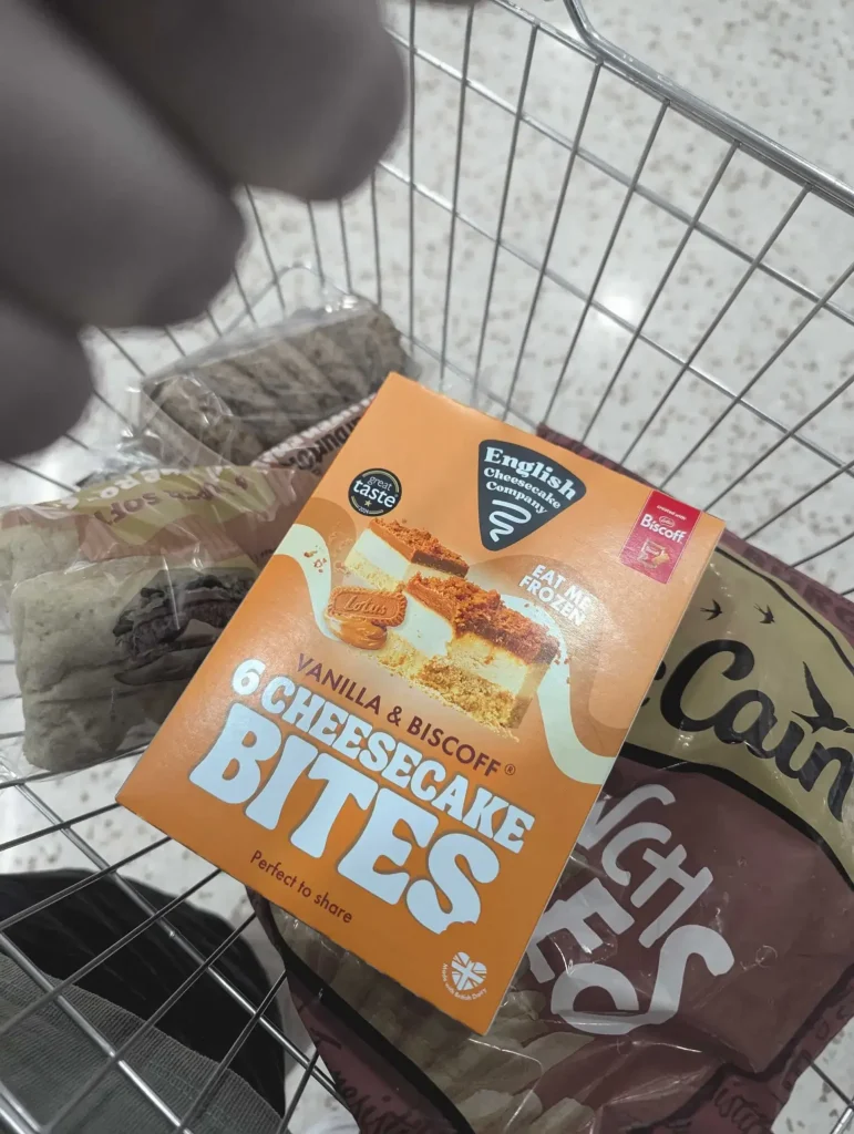
When the English Cheesecake Company approached us, they weren't just looking for a new look; they were looking for a way to dominate the frozen aisle. The frozen category is notoriously difficult: a sea of icy blues, sterile photography, and "category standards" that often feel more medicinal than indulgent.
The tension was clear: how do we maintain the artisanal, premium feel of a local bakery while ensuring the product is "retail-ready" for national distribution? Most consumers associate "frozen" with a compromise on freshness. According to industry insights from The Grocer, nearly half of consumers express concerns regarding the quality of frozen goods. To scale, we had to dismantle that perception.
The challenge was three-fold:
: Overcoming the "frozen equals low quality" bias.
: Ensuring legibility through the condensation of a freezer door.
: Creating a cohesive system that could scale from two SKUs to twenty without losing its soul.
The Result
The transformation was immediate and impactful. By leaning into "flavour-led design," we helped the "English Cheesecake Co." reclaim its position as a premium innovator. The new packaging didn't just sit on the shelf; it owned the shelf.
The brand saw a significant uplift in retail interest, securing its place in major national supermarkets and earning recognition within prestigious circles like the Pentawards. By treating the frozen state as a benefit: using the bold "Eat Me Frozen" call-to-action: we reframed the product from a "compromise dessert" into a "premium convenience."

Solution
Our approach at Wetton&Co is rooted in the belief that design must be as functional as it is beautiful. When scaling for national retail, we follow a rigorous framework that moves beyond aesthetics into the realm of commercial psychology.
1. Building a Packaging Architecture
For a brand to scale, it needs a system, not just a label. We developed a visual hierarchy for the "English Cheesecake Co." that prioritised brand recognition first, flavour second, and benefit third. This packaging architecture allowed for instant variant differentiation through a carefully curated colour palette. For example, the Lemon & Mascarpone variant used a vibrant, sun-drenched yellow, while the Biscoff range utilised warm, indulgent ambers and blues.
2. The 3-Second Rule
In a retail environment, cluttered packaging is a death sentence. We employed bold, rounded typography that projected confidence and authority. By enlarging the flavour names and product descriptors, we ensured the pack was "decodable" from three metres away. This clarity reduces the cognitive friction between impulse and purchase: a vital strategy for any brand looking to survive the supermarket scramble.
3. Materiality and Environment
Designing for the frozen aisle requires an understanding of light and texture. We tested our prototypes under harsh fluorescent lighting to ensure the colours remained vibrant and didn't "wash out." We selected finishes that felt tactile and premium, ensuring that when the consumer finally picked up the box, the physical sensation matched the visual promise.
4. Strategic Disruption
Sometimes, the best way to fit in is to stand out. While most of the category was retreating into minimalist, "quiet luxury" aesthetics, we went bold. We used a distinctive turquoise as a brand anchor: a colour territory that few others were claiming in that specific aisle. This created a brand block on the shelf, making the range impossible to ignore.
The Outcome
The true measure of a packaging design agency is not just in the awards on the wall, but in the longevity of the brand on the shelf. For the "English Cheesecake Co.", the new identity provided a platform for limitless expansion. It proved that a brand could be both playful and premium, accessible yet aspirational.
Scaling a food brand is a journey of constant evolution. Whether we are designing fictional brands for film & TV or reimagining the frozen aisle, the goal remains the same: to tell a story that people want to be a part of.
Strategic packaging is the most powerful tool in your marketing arsenal. It is the final word in the conversation between you and your customer. When done correctly, it doesn't just sell a product: it builds a legacy.

Ready to take your brand from local to nationwide?
Your product deserves to be seen. At Wetton&Co, we partner with ambitious food and beverage brands to create packaging systems that drive growth and command attention. We don't just design boxes; we build retail icons.
Let’s discuss your next project. Book a discovery call today and let’s see what we can build together.
Next Project: The Visual Identity Shift: Why Your 2026 Strategy Needs to Move