#Branding #Strategy #DesignTrends #WettonAndCo
Friday, 10 July 2026
We’ve reached a strange tipping point in 2026. For the last few years, we’ve been chasing a version of perfection that: quite frankly: has started to feel a bit hollow. With AI now capable of generating flawless, hyper-symmetrical, and mathematically "perfect" visuals in seconds, the goalposts for what makes a brand feel "premium" have shifted.
When everything is perfect, nothing feels real.
At Wetton&Co, we’re seeing a massive shift in how our clients are thinking about their brand identity strategy. It’s no longer about who has the cleanest lines or the most sterile minimalism. It’s about who looks like they were built by human hands. We call this "Intentional Imperfection": the deliberate use of raw, unpolished, and tactile elements to cut through the digital noise and build genuine trust.
The Challenge
For over a decade, the "Startup Aesthetic" defined the industry: sans-serif fonts, generous white space, and pixel-perfect grids. It was clean, it was safe, and it worked. But as AI tools became the default for high-speed content creation, that "clean" look became the new "generic."
The challenge we face today isn't a lack of quality: it's a surplus of it. When every brand can look "professional" for £10, "professional" loses its value. Our clients are finding that their audiences are developing a sixth sense for AI-generated polish. In fact, research shows that over 70% of consumers now view overly perfect visuals as less credible. They’re looking for a pulse behind the screen.
We recently explored this in our look at why 2026 branding is going tactile. The sterile trap of perfection creates a distance between the brand and the person: it feels automated, scripted, and ultimately, replaceable.
The Solution
The solution isn't to be messy; it's to be intentionally imperfect. This is a strategic move, not an aesthetic accident. When you brief your branding agency, you’re no longer just asking for a logo: you’re asking for a "Human Labor Signal."
This means we’re leaning into:
: Hand-drawn & Naïve Elements: Visible brush strokes, ink bleeds, and "awkward" proportions that AI struggle to replicate with soul.
: Wonky Typography: Custom letterforms that refuse to sit perfectly on a grid, using wobbly baselines to create rhythm and personality.
: Analog Grit: Using film grain, paper textures, and "light leaks" to ground digital designs in a physical reality.
: Visual Tension: Moving away from perfect symmetry toward layouts that feel "found" or "assembled" rather than rendered.
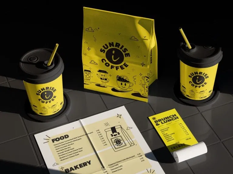
Take our work on the "Sunrise Coffee" brand suite. While the layout is strategic and the hierarchy is sharp, the inclusion of playful, slightly "rough" illustrated characters and bold, chunky typography gives it an approachability that a "perfect" corporate font simply couldn't achieve. It feels like your local spot, even if it's scaling nationwide.

The Result
The result of this shift is a brand that feels earned. When we incorporate "controlled flaws" into a brand identity strategy, we’re giving the audience permission to breathe. It’s the difference between a high-definition 3D render and a 35mm photograph: one is impressive, but the other is evocative.
By embracing imperfection, brands achieve three major wins:
- Immediate Trust: An imperfect line is a signature. It says, "A person made this." In an era of deepfakes, that’s the ultimate trust cue.
- Memorability: Perfection is repetitive. Quirks are what stick in the mind. Think of the "wonky" serif that catches your eye on a cereal box: it’s that tiny bit of friction that makes you stop scrolling.
- Emotional Resonance: We are imperfect beings. We connect with things that reflect our own reality.
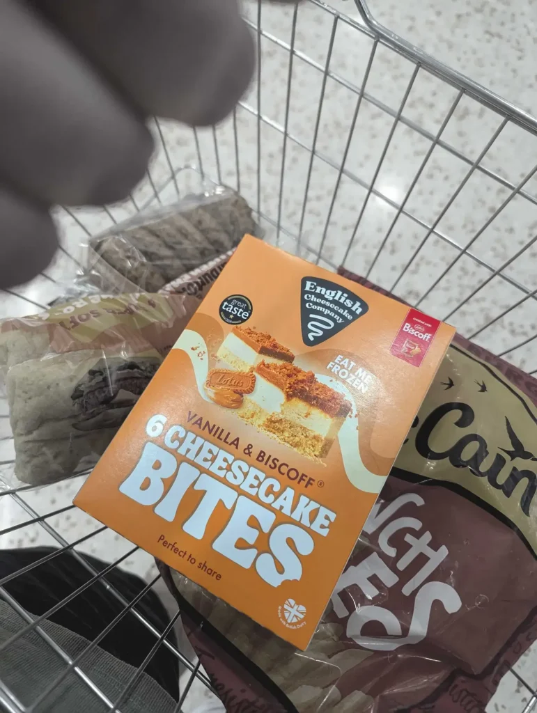
We saw this play out with our packaging for the "English Cheesecake Company." While the product photography is crisp, the surrounding brand world is vibrant, loud, and unapologetically playful. It doesn't try to be a "luxury" item in the traditional, cold sense; it tries to be a joy-filled, "eat me now" experience. That's a deliberate choice to prioritise connection over cold prestige.

The Outcome
So, how does this change the way you brief your branding agency?
It means your brief should focus on feeling and friction rather than just "clean" and "modern." When you work alongside a studio like ours, we start by identifying where the "humanity" in your brand lives. Are you a heritage brand that needs a bit of letterpress grit? Or a tech startup that needs a hand-drawn icon to keep from looking like a bot?
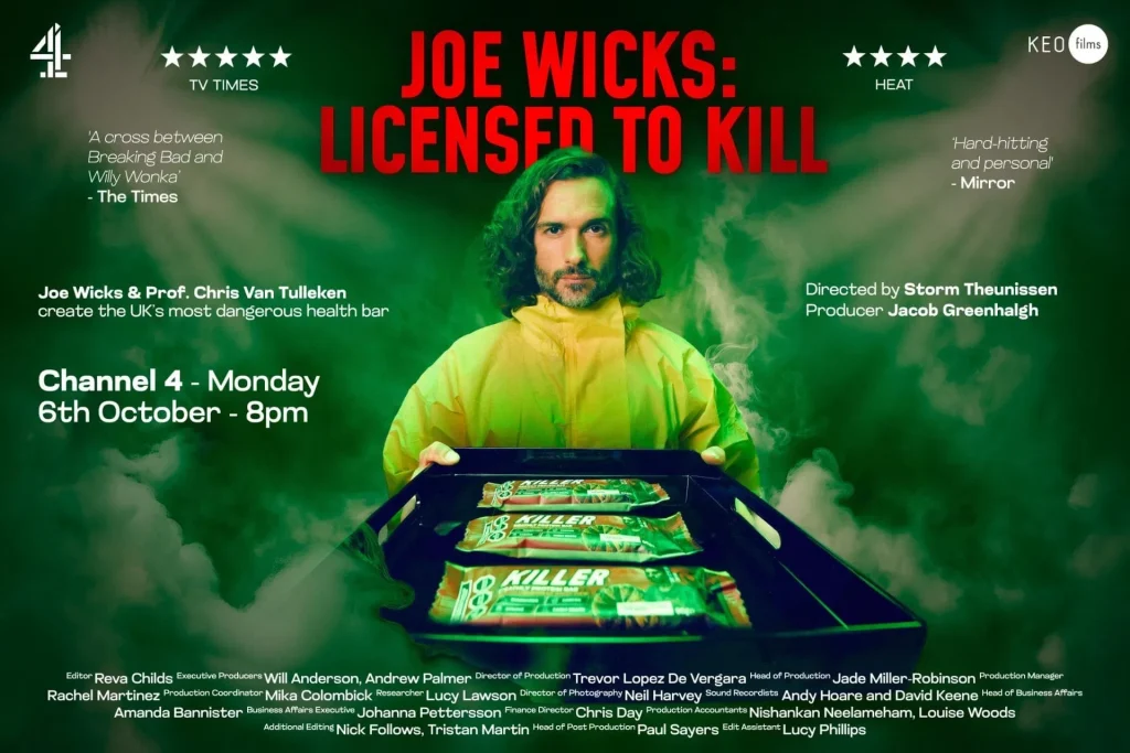
The outcome is a brand that doesn't just look "good": it looks authentic. Whether we’re designing for a fictional brand in a film production or a high-growth retail startup, the goal is the same: to create a visual language that feels alive.
In 2026, the most radical thing a brand can be is human.
We’ve moved past the era of the "perfect" logo. We’re now in the era of the "right" logo: the one that carries the weight, the warmth, and the wonderful inconsistency of the people behind it. If you’re ready to stop chasing pixels and start building a brand that people actually feel something for, we should talk.

Ready to bring a human touch to your brand?
Whether you’re looking to redefine your brand identity strategy or need packaging that actually stands out on a shelf, we’re here to help you navigate the "new normal" of 2026 design.
Get in touch with the Wetton&Co team today →
Next Project: How "New Nostalgia" is Winning the Battle for Gen Z's Attention