Image credit: Wetton&Co project media archive.
#Branding #MotionDesign #FilmAndTV #BrandIdentityStrategy
27 September 2026
A great title sequence does more than introduce a film or television programme. In a few seconds, it establishes tone, signals quality, introduces a world, and makes a promise about everything that follows.
Brands face the same challenge every day.
A logo appears on a website, a social post, a product film, a presentation, or a launch campaign, and it has almost no time to create recognition. The difference is that a strong brand does not simply animate its logo. It builds a repeatable visual experience around the mark.
That is where film and TV title design offers practical lessons.
At Wetton&Co, we work across both worlds: developing brand identities, packaging systems and campaign graphics alongside broadcast artwork, title treatments and on-screen branding. Our work with KEO Films and Channel 4 on "Joe Wicks: Licensed to Kill" brought those disciplines together in one project, from the Killer Bar packaging to social assets and title screen typography.
This is not another broad argument that every brand needs motion. We explored that in "The Netflix Effect" and "Motion Matters". Here, we are going further into the craft: what actually transfers from title design into a brand identity system, and how those techniques make a mark more distinctive, useful and memorable.
The Challenge
A title sequence has seconds to establish a world
Film and TV titles work under pressure. The audience may not know the visual language yet, but the sequence still needs to communicate atmosphere, genre and intention before the story properly begins.
A thriller cannot reveal itself with the same rhythm as a comedy. A premium documentary cannot use the same typographic energy as a youth entertainment series.
The same tension exists in brand identity.
A brand system needs to be recognisable quickly, but it also needs to carry meaning. It must balance immediate attraction with long-term familiarity, and distinctive character with practical flexibility.
That means the moving version of a brand cannot be treated as a decorative extra. It needs its own structure:
-
What appears first?
-
What is deliberately held back?
-
Which detail creates recognition?
-
How does the sequence resolve?
These decisions turn a logo into a title treatment: a designed introduction with pacing, hierarchy and narrative purpose.

Image credit: Wetton&Co project media archive.
The Result
The first transfer: design the reveal, not just the reveal of the logo
In title design, the reveal is rarely about making letters fly in because movement looks impressive. The reveal is designed to control attention.
We might introduce a texture first, establish a rhythm through repeated shapes, or allow a fragment of typography to appear before showing the complete title. The audience begins to understand the world before receiving the name.
That approach translates directly into brand identity motion.
Instead of starting with a finished logo and adding a standard scale or fade animation, we build a sequence around the brand’s central idea:
-
A hospitality brand might reveal its identity through warmth, rhythm and the movement of a service ritual.
-
A sports brand might use acceleration, impact and directional transitions.
-
A premium wellness brand might allow space, breath and material detail to carry the introduction.
The mark becomes the conclusion of a visual thought.
This is especially valuable when a brand appears across several formats. A full title treatment might lead a campaign film, while a shorter fragment can work as a social bumper, website transition or end frame. The system remains recognisable because the same reveal logic travels across every application.
The second transfer: treat type as a character
In a title sequence, typography is not neutral information. It has presence.
The typeface, spacing, scale, weight and movement all influence how the audience interprets the story. A narrow condensed face can feel urgent. A generous serif can feel established and editorial. A geometric sans-serif can feel precise, contemporary or technical depending on its treatment.
Motion intensifies those qualities.
A typeface that feels confident when static may feel aggressive when it arrives with a sharp cut. A playful wordmark may lose its character if it moves too slowly. A sophisticated identity may need restraint rather than constant animation.
Our work on "Joe Wicks: Licensed to Kill" demonstrates why typography needs to operate across connected environments. We developed a bold visual language for the Killer Bar that carried through packaging, social graphics, the documentary title treatment and wider film artwork. The typography needed to feel credible as a supermarket product while still supporting the documentary’s sharper critique of health claims and ultra-processed food.
That duality shaped the system.
The same typographic foundation could feel playful and desirable on pack, then more confrontational in broadcast graphics. The design did not lose consistency. It gained range.
This is the difference between selecting a typeface and building a typographic character.
Solution
Five title-design techniques that strengthen brand systems
1. Build an animatic before polishing the animation
Film title designers often test timing through an animatic: a rough sequence of still frames edited against sound. It allows the team to judge rhythm, pauses and emphasis before investing in detailed animation.
We use the same principle for brand motion.
A rough animatic quickly exposes problems that static artwork cannot show:
-
The logo may arrive too early.
-
A headline may disappear before it can be read.
-
A transition may feel energetic but distract from the message.
-
Several moments may compete for attention.
The animatic creates a practical conversation around pacing. It separates strategic decisions from finishing effects, allowing the brand story to become clear before the surface becomes polished.
2. Give every movement a reason
A title sequence has an internal grammar. Cuts, wipes, dissolves, distortions and morphs each create a different feeling.
A strong brand system establishes its own motion grammar.
For example, directional movement can reinforce progress or momentum. A hard cut can signal confidence. Layered reveals can suggest depth, discovery or complexity. A slower dissolve can create a feeling of care and considered quality.
The key is repetition. When the same movement logic appears across a launch film, website interaction and social graphic, audiences begin to recognise the brand before they consciously register the logo.
That recognition is one of the most valuable outcomes of a considered brand identity strategy.
3. Design the mark for movement from the beginning
A static logo does not always become a successful moving mark by accident.
Motion reveals details that remain hidden in a fixed composition: awkward joins, uneven weights, tight counters or shapes that collapse at speed. It also creates opportunities. A logo may contain a form that can separate, stretch, rotate or rebuild itself in a way that reflects the brand idea.
That is why motion should influence logo construction early.
We consider how a logomark behaves at different scales, how its parts relate over time and which elements can become useful graphic assets beyond the final lock-up. The objective is not to create a complicated logo. It is to create an identity with latent movement. A mark that can expand into a broader visual language.
This matters for brands working across digital channels, where a mark may need to perform as an app icon, a social avatar, a website loader, a video ident and a large-format campaign graphic.
4. Let sound shape the visual rhythm
Sound gives motion a spine.
In title design, music and sound effects influence when type lands, when an image changes and when the sequence resolves. The relationship does not need to be literal, but it needs to be deliberate.
Brand systems can benefit from the same approach through a sonic logo, an audio sting or a consistent sound palette. A visual identity can then be built around tempo and tone rather than animated in isolation.
We might ask:
-
Does the brand move with a sharp, percussive rhythm or a continuous flow?
-
Does the sound create energy, reassurance or tension?
-
Should the final mark arrive on a beat, after a pause or through a gradual release?
The balance between sound and image creates a more complete memory. The audience does not just see the brand appear. They feel the arrival.
5. Use restraint to create hierarchy
The strongest title sequences understand when not to move.
If every element shifts, pulses and transforms, nothing carries priority. Restraint gives the important moments weight. A single held frame can feel more powerful than a sequence of constant effects because it gives the audience time to recognise and absorb the message.
This principle transfers into every part of a brand system.
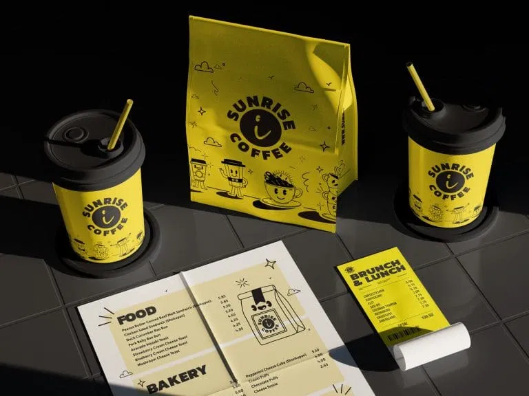
For "Sunrise Coffee", the bold yellow-and-black identity uses playful illustration and confident typography to create energy, but the system remains legible because the hierarchy is clear. The colour, characters, packaging and menu graphics work together rather than competing for attention.
For "Wildpool", the visual language moves between outdoor adventure, humour and product appeal. The identity remains coherent because the same core elements keep returning across posters, product imagery and campaign graphics.

Image credit: Wetton&Co project media archive.
A brand does not become more memorable by showing everything at once. It becomes memorable by knowing what to repeat, and what to leave out.
The Outcome
From title treatment to brand identity strategy
The most useful lesson from film and TV title design is not that brands should imitate cinematic effects. It is that every visual introduction needs a point of view.
A title sequence asks an audience to enter a world. A brand identity does the same thing across more touchpoints and over a much longer period.
That makes the system more demanding.
The identity needs to work when it is still, moving, silent, loud, large, small, cropped, printed, packaged or encountered at speed. It needs to hold together without becoming repetitive, and evolve without losing recognition.
That is where our cross-disciplinary practice matters. Working across broadcast, packaging, branding, marketing and website design gives us a practical understanding of how visual decisions behave in different environments. The title treatment cannot exist separately from the product world. The brand mark cannot ignore how it will appear in motion. The packaging cannot lose its authority when translated into a screen graphic.
Every application tests the same central idea.

Image credit: Wetton&Co project media archive.
The result is not simply a more animated logo. It is a more complete brand world: one with rhythm, hierarchy, character and room to grow.
For brands ready to move beyond a static identity, we bring the disciplines together: strategy, typography, identity design, packaging, digital experiences and motion. Working alongside your team, we can shape a visual system that introduces the right world, makes the right promise and keeps that promise across every surface.
Let’s build a brand identity that travels.
Next Project
Explore "Joe Wicks: Licensed to Kill", packaging, social and film art for KEO Films and Channel 4