#Branding #SocialGraphics #BrandIdentity 27 September 2026
Most people meet a brand in motion: between messages, on a crowded feed, with one thumb already moving.
That changes the design brief.
A brand identity can no longer be built primarily for a website header, printed brochure or business card, then adapted for social as an afterthought. A modern identity needs to perform at thumbnail size, in a 9:16 crop, across fast-moving video and through hundreds of posts created by people who may not be designers.
That is the thinking behind a social-first identity system.
The goal is not to make every post look identical. It is to build a visual framework strong enough to create recognition, yet flexible enough to keep content alive.
The Challenge
Social feeds are unforgiving.
A carefully considered layout can be reduced to a small preview, interrupted by platform interface elements or viewed for less than a second. A logo that feels elegant on a desktop website can become unreadable in a profile icon. A sophisticated typeface can lose its character when compressed into a Reel cover. A colour palette that works beautifully in print can fail when text needs to compete with bright photography and changing screen conditions.
The challenge sits in the tension between consistency and movement.
Social content needs enough variety to remain relevant. At the same time, every post should contribute to a recognisable world. Without a system, brands tend to drift:
-
One post uses a bold sans serif, the next uses a delicate serif.
-
The logo appears in a different corner every time.
-
Colours change according to whoever is producing the content.
-
Templates become overloaded with decoration because there are no clear layout rules.
-
Motion is added at the end, without any relationship to the brand’s visual language.
This is not simply a production problem. It is an identity problem.
Research from WPP on social-first brand building reflects the wider shift: social is increasingly a primary environment for brand discovery, participation and memory. Our role as a branding agency is to design for that environment from the beginning, rather than forcing a static identity to behave like a digital system.
The Result
The strongest social-first identities do three things at once:
-
They create recognition before the audience reads the name.
-
They make content easier and faster for teams to produce.
-
They leave enough space for ideas, campaigns and cultural moments to evolve.
That requires more than a logo and a set of colour swatches. It requires a working system: typography, colour, layout, imagery, motion, templates and guidance that all reinforce the same strategic position.
We approach this as a connected brand architecture.
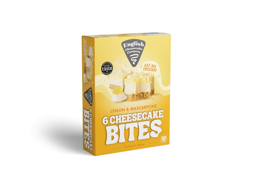
For “Sunrise Coffee”, the bright yellow, black typography and playful illustration style create a visual language that carries across packaging, menus and promotional material. The recognition does not rely on one isolated logo. It comes from the repeated combination of colour, tone, character and hierarchy.
That is exactly what a social identity needs to achieve.

Image: Wetton&Co, “Sunrise Coffee” brand identity and packaging project.
Solution
1. Design the identity at its smallest useful size
We begin by testing the identity where it has the least room to perform.
That means looking at:
-
Profile icons and avatars.
-
Feed thumbnails.
-
Reel and Story covers.
-
Small overlay logos.
-
Mobile screens viewed in bright or low-contrast conditions.
A social-first logo system often needs several connected expressions: a primary wordmark, a compact logomark, a stacked version and a one-colour option. Each has a role. The full wordmark may work on a campaign opener, while the logomark carries recognition in a circular avatar or small video corner.
We do not treat this as reducing the brand. We treat it as giving the brand more ways to remain itself.
Our own Wetton&Co identity uses a distinctive monogram that can operate independently from the full name. That creates flexibility across social avatars, title graphics, project imagery and motion without losing authorship.
The practical test is simple: reduce every important element until it reaches the smallest realistic use. If the mark, headline or contrast disappears, the system needs another decision.
2. Build typography for interruption
Typography on social has to survive distraction.
A post may be viewed while the audience is walking, commuting or switching between several pieces of content. Headlines therefore need a clear hierarchy and a strong first read. Long copy belongs in the caption or carousel structure, not squeezed into a single frame.
We define a small number of reliable typographic roles:
-
A headline style that creates immediate impact.
-
A supporting style for context and explanation.
-
A functional style for labels, dates and calls to action.
-
A caption or detail style that remains legible without becoming dominant.
The system should also show how type behaves when the content changes. A product launch, customer quote and behind-the-scenes post may use different compositions, but the relationship between scale, spacing and alignment should remain familiar.
For “Holistic Nomad”, the identity balances calm, elevated typography with a digital platform containing complex functionality. That balance matters on social too: wellness can feel considered without becoming vague, while information remains clear enough to act on.
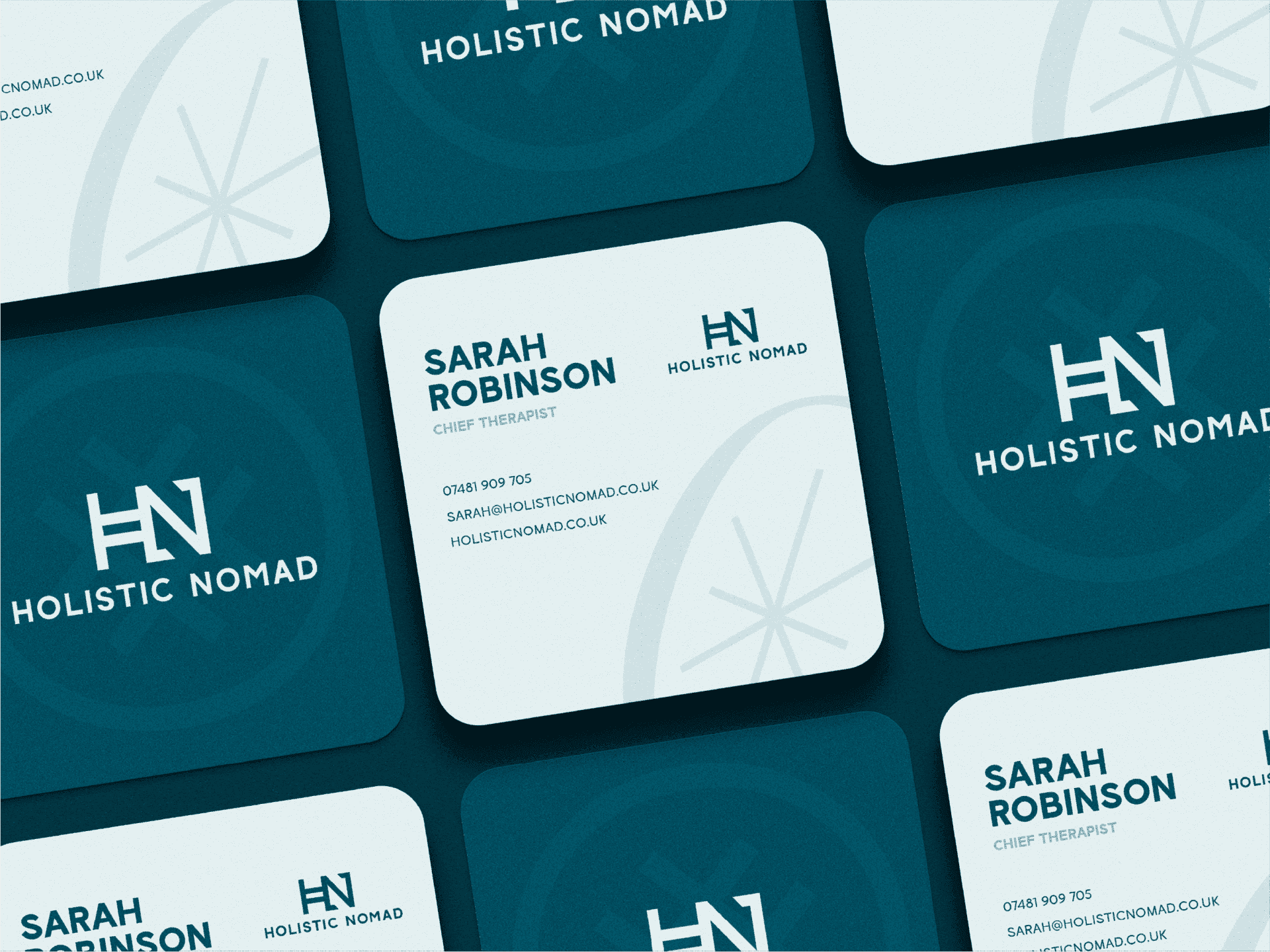
Image: Wetton&Co, “Holistic Nomad” brand identity and website design project.
3. Treat safe zones as part of the layout
Safe zones are not empty space left over after the design is finished.
They are planned areas that protect the information most important to recognition and action. On vertical formats, the top and bottom of the frame may be interrupted by platform navigation, account details, captions or call-to-action controls. The exact interface varies, so a robust system defines internal margins that keep essential content away from those risks.
We create layout rules for:
-
Headline placement.
-
Logo position.
-
Subtitles and captions.
-
Product information.
-
Calls to action.
-
The areas where imagery can crop without damaging the message.
The system should also show what happens when a design moves from one format to another. A square post cannot simply be stretched into a Story. The hierarchy needs to be rebuilt for the new proportion, while the brand cues remain intact.
That is where a grid becomes valuable. A consistent grid gives non-designers a dependable starting point and gives designers enough structure to work quickly across campaigns.
4. Build templates that protect the important parts
Templates should not make every post look templated.
Their job is to lock the elements that protect recognition while leaving the content open enough to feel current. We typically separate the system into fixed and flexible components.
Fixed elements may include:
-
Core typography.
-
Primary and supporting colours.
-
Logo treatment.
-
Corner radius or graphic shape language.
-
Spacing relationships.
-
Motion behaviour.
Flexible elements may include:
-
Photography.
-
Product arrangement.
-
Headline length.
-
Illustration and graphic accents.
-
Campaign-specific colour emphasis.
A useful template kit might include announcement posts, product features, testimonials, carousel covers, quote cards, event graphics, Story frames and Reel covers. The value comes from the relationships between them. A viewer should recognise the same brand whether the post is selling, explaining, celebrating or responding.
Our marketing design work focuses on that connection between campaign idea and repeatable execution. The identity should give a marketing team momentum, not create another approval bottleneck.
5. Give motion its own rules
Motion cannot be treated as decoration added after the static identity is complete.
A social-first system needs a clear motion language: how elements enter, how quickly they move, how text appears and how the logo behaves. A playful brand may use energetic scale changes and graphic rebounds. A premium identity may rely on measured fades, precise cropping and slower transitions.
The important point is not to animate everything. It is to make movement recognisable.
We define reusable motion presets for:
-
Logo reveals.
-
Text entrances.
-
Carousel transitions.
-
Product showcases.
-
Cut points between video scenes.
-
End frames and calls to action.
These presets help teams create Reels, Stories and campaign edits that feel connected without asking every creator to reinvent the brand’s movement language.
The result is a system that behaves consistently at speed.
The Outcome
A social-first identity gives a brand more than attractive content. It gives the organisation a shared visual instinct.
Teams know which layouts to reach for. Designers understand what can evolve. External partners have clearer boundaries. Campaigns move faster because fundamental decisions have already been made. Most importantly, the audience begins to recognise the brand through repeated visual signals before consciously processing every message.
That is why consistency beats novelty in the feed.
Novelty may earn a moment of attention. Consistency builds memory.
A social identity should still make space for surprise, but surprise works best when it arrives inside a recognisable world. The colour, typography, composition and motion create continuity; the campaign idea creates the reason to stop.
This is the distinction between a content template and a brand system.
A template repeats a layout. A system repeats a point of view.
For growing businesses, marketing teams and agencies, that distinction becomes increasingly valuable. As content volume expands, a brand cannot depend on one designer making every decision. It needs rules that are clear enough to share and intelligent enough to adapt.
We build identities for the full journey: from brand strategy and identity through to social graphics, packaging, websites and motion. The strongest systems do not divide those touchpoints into separate worlds. They allow each one to reinforce the others.
If your brand is being discovered in the feed, we can work alongside your team to build an identity that remains clear at speed, recognisable at thumbnail size and flexible enough for what comes next. Let’s create a social-first system that gives every post a stronger point of view.