Categories: Marketing, Branding, Presentation Design
Date: 27 September 2026
A pitch deck can win the room before the presentation begins.
It can also quietly lose the work before anyone reaches the second slide.
For many marketing agencies, pitch decks and credentials documents are among the most important assets they produce, yet they are often the least considered. The thinking may be sharp. The strategy may be sound. The team may be exceptional. But when all of that arrives as a dense, inconsistent document, the value becomes harder to see.
We see pitch design as a commercial design problem, not a decorative one.
The strongest decks create a clear balance between narrative and evidence, confidence and restraint, personality and usability. They help prospective clients understand not only what an agency does, but why its approach is the right one for the challenge in front of them.
That is the real advantage of considered marketing agency design: it makes good thinking easier to recognise.
The Challenge
Most pitch documents do not fail because the agency lacks capability.
They fail because the capability is buried.
A credentials deck often grows organically over time. A new case study is added here. A team slide is copied from an older proposal there. A new service page appears in a different typeface. Eventually, the document becomes a collection of useful information without a clear journey through it.
We usually find four recurring problems:
-
Too much copy: every point feels important, so nothing receives emphasis.
-
No hierarchy: headlines, supporting information and proof carry the same visual weight.
-
Inconsistent case studies: each example follows a different structure, making comparison difficult.
-
Over-designed slides: visual effects, decorative graphics or complex layouts begin to compete with the message.
These issues create friction at precisely the wrong moment. A prospective client is trying to answer a simple question: Can this agency understand our problem and make a meaningful difference? If the document makes that answer difficult to locate, the agency creates unnecessary doubt.
A pitch deck is not an archive of everything an agency has ever done. It is a carefully edited argument.
The challenge is to establish that argument before any layout begins.
The Result
The best pitch documents make an agency feel more focused, more credible and more distinctive, without pretending to be something it is not.
We have seen this principle play out across our own branding and campaign work. When we built the visual system for "Sunrise Coffee", the strength did not come from one isolated logo or one attractive package. It came from the relationship between the elements: typography, colour, illustration, menus, takeaway packaging and social applications all reinforced the same idea.

Wetton&Co project imagery: "Sunrise Coffee" brand identity and packaging system.
That same thinking applies to a pitch deck.
A deck should behave like a brand system:
-
It needs a clear central idea.
-
It needs recognisable visual rules.
-
It needs enough flexibility to handle different types of content.
-
It needs consistency without becoming repetitive.
-
It needs to communicate effectively across multiple formats.
This is where marketing agency design becomes a competitive advantage. A well-structured deck does not simply make an agency look polished. It demonstrates the discipline, clarity and judgement that clients expect to see in the work itself.
The document becomes part of the proof.
Solution
We begin with the narrative, not the slides.
Before choosing layouts, we establish what the prospective client needs to understand, believe and decide. This usually creates a structure that feels more like a conversation than a catalogue:
-
The opportunity: what is happening in the client’s market or organisation?
-
The tension: what is preventing progress, clarity or growth?
-
The insight: what have we understood that changes the way the problem should be approached?
-
The proposed response: what will the agency do, and why will that approach work?
-
The proof: where has the agency demonstrated relevant capability?
-
The next step: what should happen after the pitch?
This sequence gives every slide a job.
It also helps us decide what to remove. If a credential, statistic or service description does not support the central argument, it may belong in a separate credentials document rather than the main pitch.
Prepare the thinking before the design
The design process becomes faster and more decisive when the content is prepared properly. Before we start, we ask agencies to gather:
-
The client brief, including the commercial context and decision-making criteria.
-
A clear statement of the proposed opportunity.
-
The audience for the presentation and the likely level of industry knowledge.
-
Relevant case studies, with consistent information about the challenge, approach and outcome.
-
Confirmed facts, figures, testimonials and permissions for client work.
-
The names and roles of the people who will actually work on the account.
-
Any constraints around timing, pricing, confidentiality, accessibility or delivery format.
-
The intended use: live presentation, PDF follow-up, recorded pitch or all three.
This preparation does not need to be perfect. It does need to be honest.
A design partner can help shape raw material, but design cannot resolve an unclear offer or invent evidence that does not exist. Stronger results come from identifying those gaps early, while there is still time to address them.
Build a reusable presentation system
We do not approach a pitch deck as a one-off composition. We build a presentation system that can support the next pitch, the next credentials update and the next internal presentation.
That system may include:
-
Cover and section divider layouts.
-
Problem and insight slides.
-
Process diagrams and timelines.
-
Case study structures.
-
Data visualisation and KPI layouts.
-
Team profiles.
-
Service and capability slides.
-
Testimonial and quotation treatments.
-
Pricing and next-step formats.
The purpose is not to create a rigid template. It is to create a controlled set of possibilities.
A reusable system gives an agency speed without forcing every pitch into the same shape. New content can be added while the visual language remains recognisable. The team can adapt the deck themselves, while the most important rules (spacing, type scale, colour use, image treatment and hierarchy) remain protected.
Our work on "Holistic Nomad" demonstrates this kind of connected thinking. The project brought together identity, brand guidelines, digital experience and practical platform functionality. The system had to remain clear across different touchpoints while supporting more complex information underneath.

Wetton&Co project imagery: "Holistic Nomad" brand identity system.
A pitch deck needs the same balance: simple enough to navigate, flexible enough to carry complexity.
Design for the room as well as the screen
A deck that works beautifully as a PDF may fail in a meeting room.
Small text disappears. Pale colours lose contrast. Dense charts become unreadable. Slides designed for individual reading can feel empty when projected, while highly animated presentations can become difficult to share afterwards.
We design for both conditions.
That means considering:
-
Large, legible type that works at a distance.
-
Clear contrast for projectors and varied screens.
-
One primary message per slide.
-
Visual pauses between dense sections.
-
Charts and diagrams that can be understood quickly.
-
Speaker notes or supporting material where detail is necessary.
-
A PDF version that still makes sense without narration.
The deck should guide the conversation rather than replace it. It gives the presenter confidence, but it should never become a script that prevents genuine discussion.
This is also why we avoid over-designed slides. A distinctive visual approach matters, but the design must reinforce the agency’s thinking. If a transition, texture or graphic device attracts more attention than the insight it is meant to support, the balance is wrong.
Make case studies comparable
Case studies often carry the most persuasive material in a pitch. They show how an agency thinks in practice.
They also become much less effective when each one is presented differently.
We recommend a consistent structure:
-
The challenge: what needed to change?
-
The response: what did the agency do?
-
The reasoning: why did that approach make sense?
-
The outcome: what changed, launched or improved?
This does not mean every project needs identical wording or identical imagery. It means the audience should understand how to read each example.
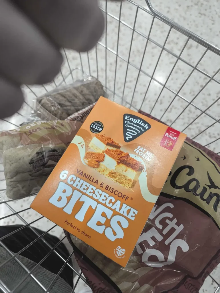
Our work across packaging, branding and campaign design gives us useful material for this kind of structure. The "English Cheesecake Company" project, for example, involved creating a visual system that could scale across multiple products, flavours and retail contexts.
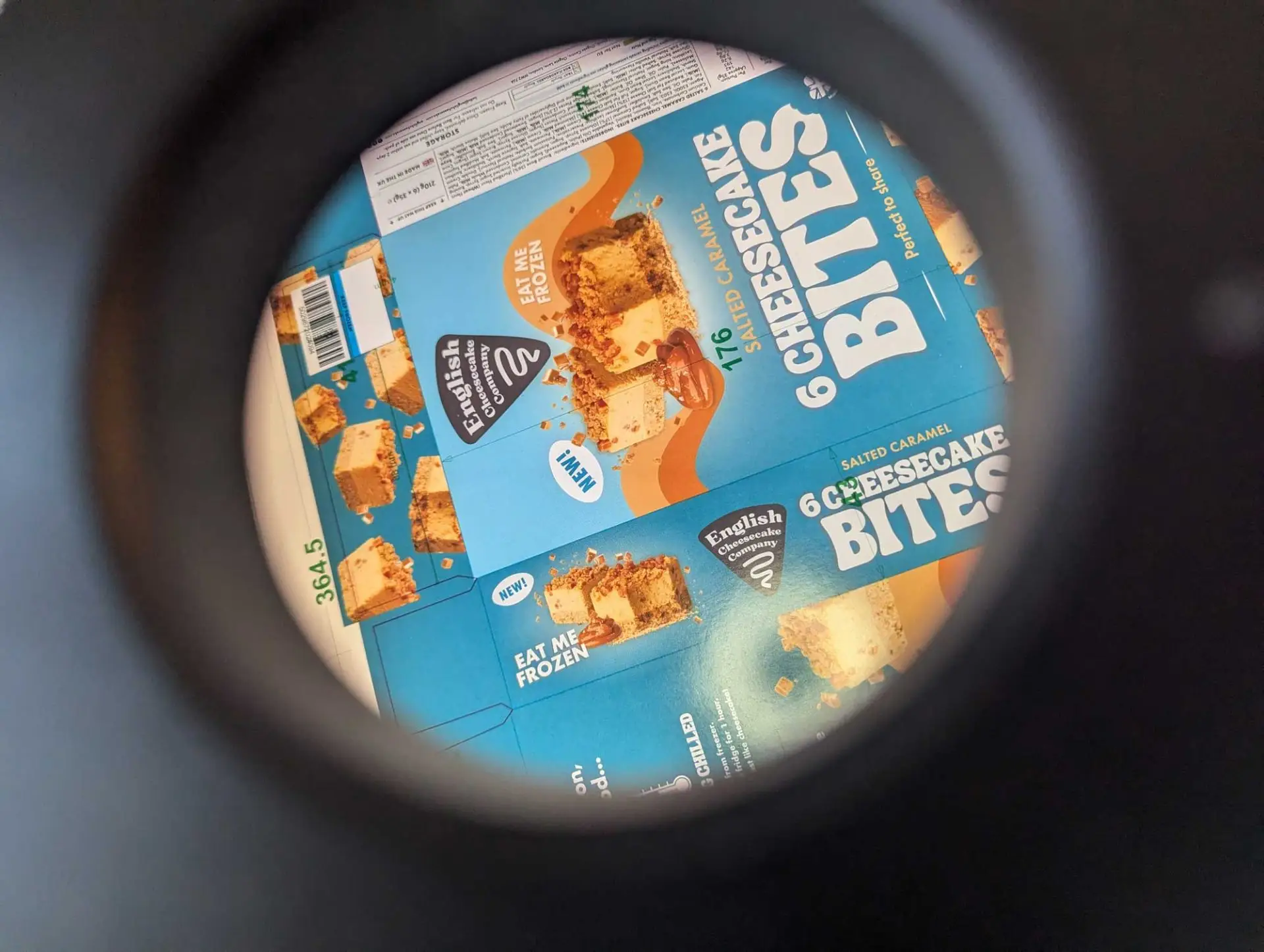
Wetton&Co project imagery: English Cheesecake Company packaging in a retail environment.
The important point is not simply that the packaging looked distinctive. The case study can show the commercial tension (premium yet approachable, consistent yet flexible) and explain how the design system addressed it.
That kind of explanation is more useful than a gallery of disconnected images.
The Outcome
A better pitch deck does more than improve presentation quality.
It changes how an agency’s value is understood.
When the narrative is clear, the client spends less time decoding the document and more time considering the opportunity. When the case studies follow a consistent structure, the agency’s range becomes easier to compare. When the system is reusable, the team can respond faster without starting from a blank page. When the deck works in the room and afterwards, the pitch continues beyond the meeting.
This is the deeper role of marketing agency design: not making an agency appear more capable, but making its capability easier to experience.
The mistakes that sink pitch documents are rarely dramatic. They are usually small decisions repeated too often: another paragraph, another unstructured case study, another inconsistent slide, another decorative element without a strategic purpose.
We solve those problems by returning to the same principle: every design choice should help the audience understand, remember or believe something that matters.
A pitch document should feel like the work it promises to deliver: thoughtful, focused, distinctive and built around a clear idea.
For agencies preparing a major proposal, refreshing credentials or creating a presentation system that can evolve, we work alongside teams to shape the narrative, establish the visual logic and create a deck that remains useful long after the first pitch.
Explore our marketing design work or view our branding projects to see how we build visual systems that carry ideas across multiple touchpoints.
If the next pitch needs more clarity, more confidence and a stronger connection between strategy and design, let’s work through it together.
Next Project: From Local to Nationwide: How Strategic Packaging Scales Food Brands for Retail →