#WebDesign #Branding #Strategy 4 September 2026
10 min read
Great web design is not decoration.
It is a conversion engine: a carefully structured experience that turns attention into confidence, confidence into action, and action into a meaningful business outcome.
That action might be an enquiry, a booking, a product purchase, a newsletter sign-up, or a qualified lead. The outcome changes from project to project, but the principle remains consistent : every design decision needs a job.
As a website design studio working across Brighton and London, we approach websites as part of a wider brand and marketing system. We combine visual hierarchy, clear calls to action, brand-led trust cues, mobile-first structure, and technical performance to create digital experiences that work harder than a static brochure.
This is the commercial follow-on to our piece on Website Design Studio vs. Website Builder. The question now is sharper: how does a website earn its investment back?
The Challenge
The most expensive website is rarely the one with the highest initial budget.
It is the website that attracts attention but fails to create momentum.
We see the same problems repeatedly:
: The homepage looks polished, but the value proposition is unclear.
: The navigation contains too many competing routes.
: Calls to action use vague language such as “Learn more” or “Submit”.
: Trust signals sit several pages away from the point of decision.
: Mobile layouts feel like compressed desktop pages.
: Large images, unnecessary animations, and third-party scripts slow everything down.
These issues create friction. Visitors hesitate, lose context, or leave before the brand has had the chance to make its case.
A website builder can help a business get online quickly. An in-house team can create useful content and maintain day-to-day updates. But when the website needs to carry positioning, persuasion, usability, and measurable commercial performance at the same time, the challenge becomes more complex.
We need to answer several questions before we design a single page:
: Who is arriving, and what do they already know?
: What does the visitor need to understand first?
: What concern might stop them taking action?
: What is the most valuable next step?
: How will we know whether the experience is working?
That is where a website design studio adds value: not by adding more visual detail, but by creating a more deliberate route through the information.
The Result
The result of conversion-first design should be visible in behaviour, not just appearance.
We measure whether the right people are moving through the website with greater confidence. Depending on the project, that means looking at:
: Primary call-to-action clicks.
: Form starts and completed enquiries.
: Bookings, purchases, or account registrations.
: Movement between key pages.
: Mobile and desktop conversion differences.
: Lead quality and source.
: Engagement with case studies, services, pricing, or product pages.
: Core Web Vitals and page speed.
This gives us a clearer definition of return on investment. A website does not create value simply because it receives traffic. It creates value when the experience helps more of the right visitors take the right action.
We can then connect those actions to commercial information: average contract value, close rate, repeat purchase value, or the cost of acquiring a customer.
A simplified model might look like this:
Qualified leads × close rate × average customer value = potential revenue influenced by the website.
The model is not a substitute for proper attribution. It is a way to connect creative decisions with business reality.
This distinction shapes how we work alongside founders, marketing teams, and agencies. We do not design a beautiful interface and hope the numbers follow. We define the intended behaviour, build the system around it, and create the measurement framework to learn from what happens next.
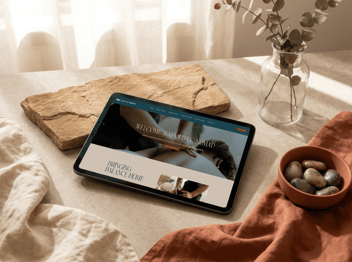
Holistic Nomad project image : Wetton&Co.
Solution
1. We build the visual hierarchy around the decision
Visual hierarchy controls the order in which information is noticed and understood.
A conversion-first page usually has a clear sequence:
: A direct headline that establishes relevance.
: A supporting statement that adds specificity.
: A primary call to action that makes the next step obvious.
: Trust cues that reduce perceived risk.
: Supporting content for visitors who need more detail.
This does not mean every page needs to look formulaic. We can still create bold, expressive layouts with unexpected typography, strong colour, and distinctive art direction. The difference is that the creative choices remain deliberate.
Contrast should highlight the action. Spacing should give important content room to breathe. Typography should establish confidence and make complex information easy to scan. Imagery should reinforce the message rather than compete with it.
We often return to the same balance: attraction versus clarity.
A page needs to make people stop scrolling, but it also needs to tell them where to go next.
2. We make calls to action specific and useful
A call to action is not a decorative button.
It is the point where intent becomes movement.
“Get in touch” may be appropriate in some contexts, but more specific language often carries greater meaning:
: “Book a project consultation.”
: “Request a packaging review.”
: “View the full case study.”
: “Start your website project.”
: “Explore the menu.”
The most effective CTA depends on the visitor’s level of readiness. Someone discovering a brand for the first time may need a softer step, while someone comparing suppliers may be ready to request a proposal.
We use a clear primary CTA, then structure secondary actions around it. That creates focus without forcing every visitor into the same journey.
3. We use the brand as a trust mechanism
Trust is not added at the end of the process with a row of client logos.
It is built through the entire design system.
A strong brand-led website creates confidence through:
: Consistent typography and colour.
: Clear and considered language.
: Relevant case studies.
: Specific service explanations.
: Recognisable visual assets.
: Evidence of experience and capability.
: A coherent tone across every touchpoint.
For Holistic Nomad, we worked on the identity and digital platform as one connected system. The platform needed to feel calm, elevated, and trustworthy while supporting advanced enquiry forms, interactive map-based browsing, preference-led filtering, and automated workflows.
The challenge was balancing simplicity on the surface with depth underneath. The result was a digital experience designed to make exploration and connection feel natural, even when the functionality behind the interface was complex.
That is the role of brand in conversion: it reduces uncertainty before the visitor has to ask a question.
4. We design mobile-first, not mobile-later
Mobile-first design is not simply making a desktop layout responsive.
It means deciding what matters when space, attention, and typing ability are limited.
We prioritise:
: Shorter content blocks.
: Clear page titles.
: Tap-friendly buttons.
: Simple forms.
: Thumb-accessible actions.
: Fast-loading imagery.
: Navigation that does not make visitors work.
The mobile experience often exposes weaknesses that desktop can hide. A complicated menu becomes difficult to use. A long form becomes exhausting. A low-contrast CTA disappears. A decorative animation becomes a performance problem.
We begin with the essential journey, then expand the experience for larger screens. This keeps the core interaction focused and helps us protect the commercial purpose of the page.
5. We treat page speed as part of the design
Performance is often discussed as a technical concern, but visitors experience it emotionally.
A slow page creates doubt. A shifting layout feels unreliable. A delayed interaction interrupts momentum.
Google’s Core Web Vitals guidance focuses on loading, interactivity, and visual stability. Its current thresholds include a Largest Contentful Paint of 2.5 seconds or less, Interaction to Next Paint of 200 milliseconds or less, and Cumulative Layout Shift of 0.1 or less.
We use tools such as PageSpeed Insights to identify opportunities, then connect those findings back to design decisions:
: Compressing and correctly sizing images.
: Reducing unnecessary scripts.
: Limiting heavy visual effects.
: Building stable layouts that do not jump as content loads.
: Designing focused pages rather than filling every space.
Speed is not the enemy of character. It simply means that character needs to be built with discipline.

Sunrise Coffee project image : Wetton&Co.
The Outcome
Conversion-first design does not remove creativity.
It gives creativity a clearer purpose.
For Sunrise Coffee, we developed a visual identity and website experience that carried the same bright, playful energy from the café environment into the digital space. The website structure focused on making menus and products easy to browse, while the bold illustration system and typography created recognition across packaging, signage, social content, and the website.
That consistency matters commercially. When people encounter the same visual cues across multiple touchpoints, they spend less time working out whether they are in the right place. The brand becomes easier to recognise and easier to remember.
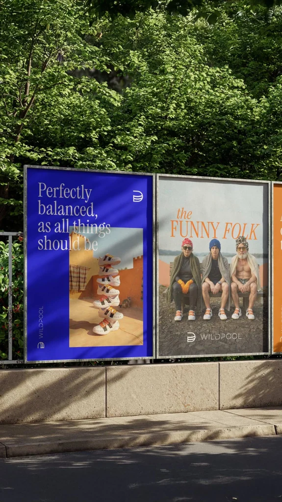
For Wildpool, we approached the website, ecommerce experience, community features, and marketing rollout as part of the same adventure-first brand system. The website was designed around early-adopter conversion, while the wider project included social content, launch campaigns, investor proposals, and a prototype community app.
The website is still being developed, so we do not attach unsupported post-launch conversion claims to the project. That distinction matters. Good reporting separates what a design system is intended to achieve from what the data has already proved.
Instead, we define the measurement plan from the beginning:
: Which action counts as a conversion?
: Which routes lead to that action?
: Where do visitors drop out?
: Does mobile perform differently from desktop?
: Which trust cues influence enquiry quality?
: What should we test next?
This turns a website from a finished deliverable into an evolving commercial asset.
A website design studio should bring more than design execution. We should bring a way of thinking that connects brand expression with user behaviour and business outcomes.
The strongest websites balance boldness and usability, storytelling and structure, premium expression and speed, creative ambition and measurable intent.
They do not ask visitors to work harder than necessary.
They make the next step feel obvious.
If we are considering a new website, the starting point is not a template, a colour palette, or a list of features. It is the commercial question behind the project: what should this experience help the business achieve?
From there, we can shape the structure, identity, content, interaction, and measurement around a shared ambition.
Explore our website design work, or book a conversation with Wetton&Co about building a digital experience that looks distinctive, performs clearly, and grows alongside the brand.
We do not see the website as the end of the design process. We see it as the point where the brand begins working harder.
Next Project : Why Marketing Agencies Outsource to a Dedicated Design Studio