

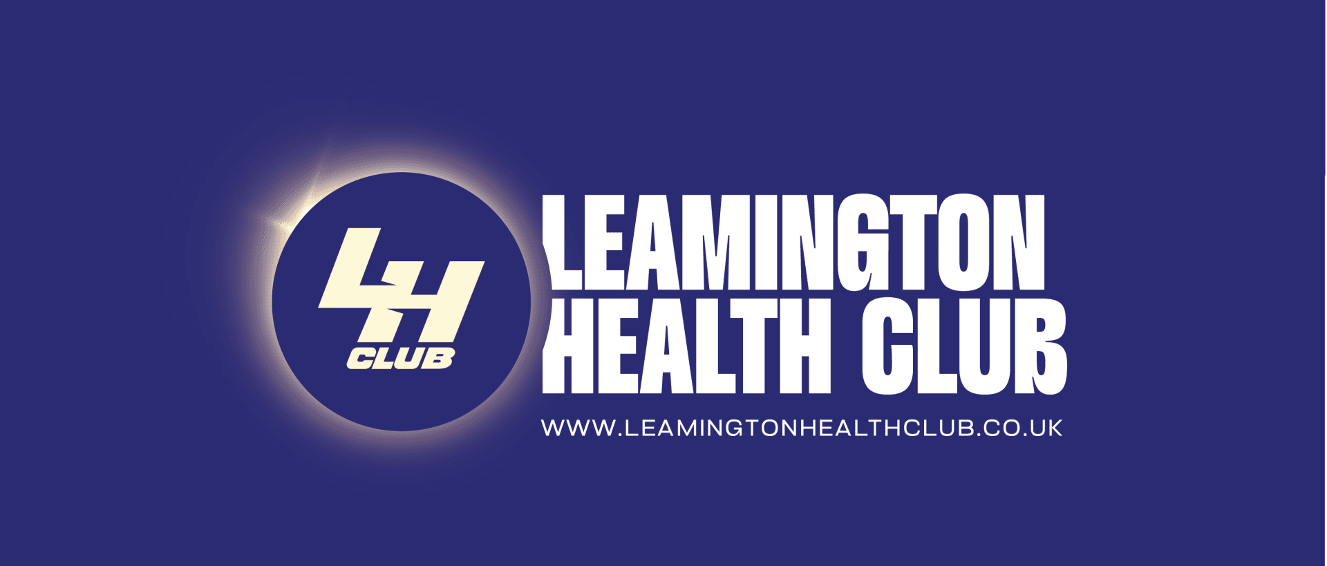
Leamington Health Club

Leamington Health Club – Brand Identity Redesign
Formerly known as Core Gym, Leamington Health Club approached us to deliver a refreshed brand identity that would better reflect their community values and ambitious vision for the future.
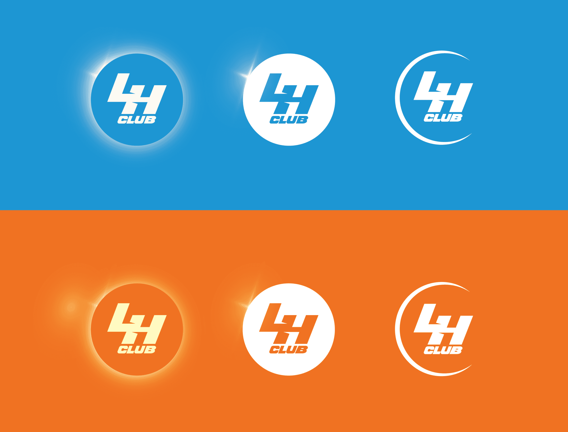
Working closely with Jens, who had a clear idea of the direction, we developed a solar-eclipse inspired logo that symbolises energy, unity, and renewal. This, combined with carefully chosen fonts, colours, and a versatile identity system, created a brand that feels both contemporary and welcoming.
To ensure a seamless rollout, we produced full brand guidelines and a curated asset library for the in-house marketing team, empowering them to launch with consistency and confidence from day one.
Deliverables:
Logo redesign and solar-eclipse brand concept
Full brand identity system (colours, fonts, and application)
Vision and brand direction development
Comprehensive brand guidelines
Curated brand asset folder for marketing team rollout
Task
Logo Redesign